Back in June 2012, Microsoft launched a preview for the upcoming Microsoft.com, which seemed entirely different from its old layout. And by far at Friday, the preview design went live on Microsoft.com that reflects a fresh and brighter look with less clutter than before.
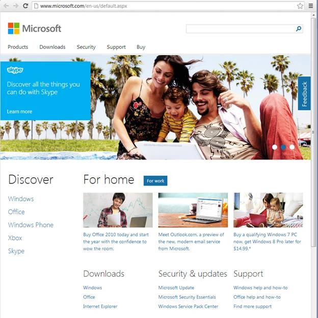
The latest design of this website fits to any screen resolution you display the homepage in. This new home page consist a dominant element that is the large banner advertising Microsoft products and services. Right now, it is showing teaser banner of Bing on it with Skype and Visual Studio.

It is quite interesting to see that these designs are different depending on which web browser you use to access the Microsoft homepage. The above showed homepage is displayed to Google Chrome, Internet Explorer 10 and Opera users only. Other than it, Firefox and Internet Explorer users would see an entirely different design, as following:

In both designs, the top of the page is nearly identical while the search bar is displayed prominently as well as the links to products, downloads, security and buy. But the first difference is the distinction between home and work on the Firefox and IE9 page while you can switch between work and home on the IE10 and Chrome design page as well, as it will not change the teaser banner at the top.
Currently, it is not clear that why Microsoft decided to launch the site with varied designs based on browsers.


Layout is change here!
layout matches like windows 8 i guess
No link to http://www.microsoft.com so that we can open directly!
Steve Ballmer, The CEO after Bill Gates, with his team trying its level best to maintain the supremacy and Monoply of Microsoft with these changes. Also, it was high time to change the interface and logo as it was quite an old and need a major revamp to have interesting features look more attractive to its users.
www(.)bloggingchunks(.)com
Tottal Touch layout :P