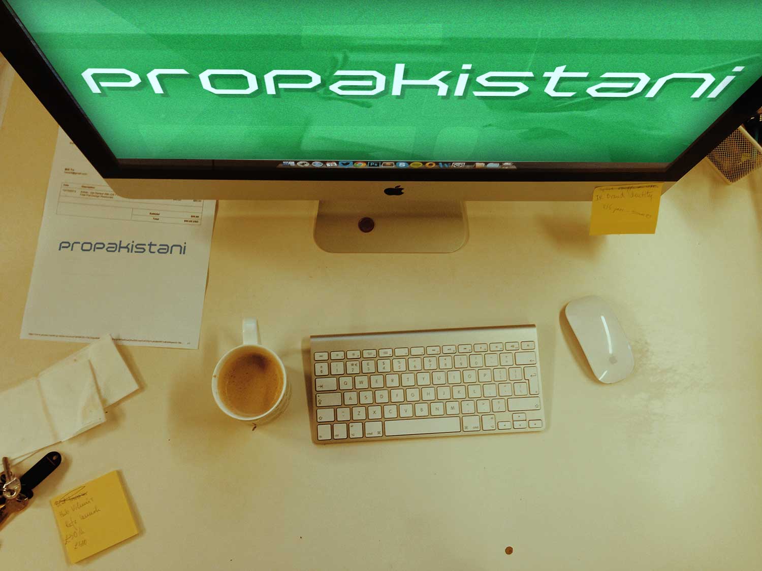
Hey all,
It’s Ahmad Awais here, me and my team built the new version of ProPakistani. Here is something I had to say about it.
Like many other tech-junkies, ProPakistani.pk has been a permanent fixture in my RSS feeds for a number of years. I’ve watched them grow from a fairly lowbrow tech blog into a thorough, to the point, truly valuable online telcos resource. Part of that has been seen partly from ‘the inside’, as my team is contributing content here for sometime now, and I’m happy to say that my involvement now runs even deeper: I designed & developed the fourth version of ProPakistani.
I applaud ProPakistani.pk, because Aamir Attaa and his team has always given their level best when it came to breaking news relevant to telcos niche. Not only this but I believe that ProPakistani has evolved into something much bigger than what it used to be, due to continued improvement; something that is obvious when you go and compare quality of today’s articles with those posted a couple of years ago.
However, for a long time I had this feeling that ProPK design is holding it back somewhat, nodding back to the days when it was a less well-respected blog in Pakistan. So, when Aamir Attaa asked me if I’d like to redesign the site, I jumped right in at the chance: in my mind, this could be the opportunity for the visuals to more accurately reflect the quality of the content within.
So after multiple sleepless nights, ever changing deadlines (due to the political situation in Pakistan), me and my team, finally present you all, with the latest re-design of ProPakistani; the fourth as they say.
To define what’s what and how we did everything you see I planned to write about it, about the process as we went through it. Neither I or the ProPakistani team have any plans to ‘crowdsource’ feedback, but this is a rare opportunity, one can get, to talk about some of the decision-makings, and yet I’m a big fan of transparency.
Step # 1: The pinned points
When Aamir Attaa contacted me for a redesign, our team after three meetings pitched a proposal of what we intended to deliver. After certain discussions over Skype one of the three tracks, we pitched, was approved. Then there was a meeting between two designers including me, three developers and a third party designer. Which led us to few key improvement factors: The pinned points
- Flat
- Trendy
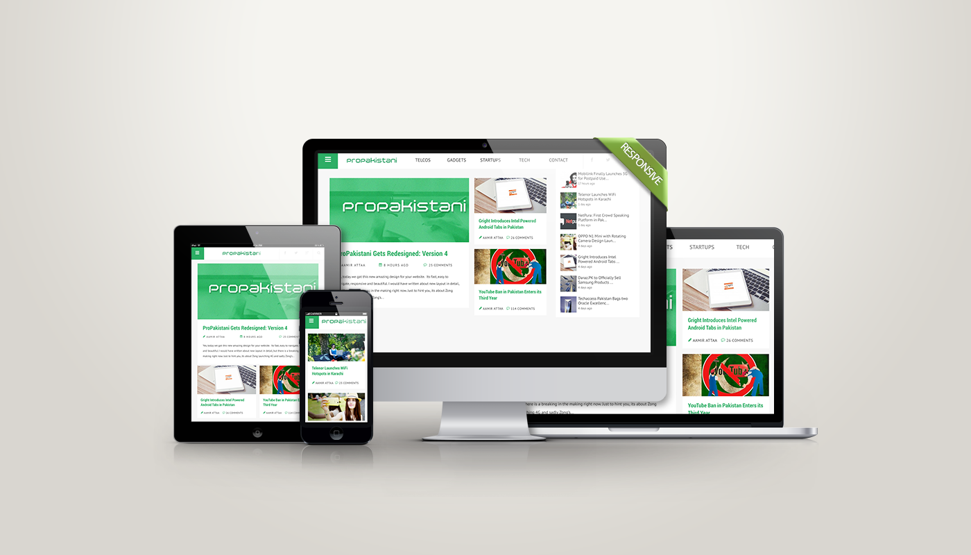
- Responsive
- Sleek & the bigger the better approach
- Pagespeed & more intuitive custom notifications
In the beginning to form loose ideas of a possible aesthetic, as well as tackle the somewhat complex issue of ProPK extensive categories and how to create a complex responsive design, we started off with the above points.
Step # 2: Design Phase
Design process started with a lot of research followed by several discussions and if my recollection of lost isn’t misleading me, then we had 23 meetings. One thing I’d like to mention about my team is, we don’t sit in form of groups of designers, developers, etc. but we keep on changing our sitting arrangements depending upon the projects we are working over.
To be more clear, let’s say we got the ProPk’s project, the RFP (request for proposal) was addressed and stuff was finalized. Then in-house we decided about how much time each and everything will take, to who will be working over what. We manage all this stuff over an internal dashboard, where all the set of tasks are created by a particular project lead, who then assigns each and every task to a particular person. Then at the very end we get to have the names of all the team members working over a particular project, i.e. ProPakistani. We had two designers and three developers working over this project. So, now whenever these five people are working over ProPK, it is compulsory for them to be seated together. This workflow enhances the performance of team members and reduces a lot of fuss.
Finalizing the design
What started with three different designs after a research over 200+ sites ended up in one single workflow within the third week. After that, all we had to do was design what we had in the form of sketches over pages. Took hardly 5 days and we had a winner. 2 quality assurance tests led to the final design pitch which later got approved by Aamir Attaa and his team. It was something like the one below.
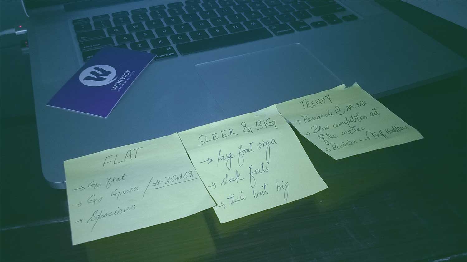
Key design aesthetics
- Introduce lighter green color, #35ad68
- Enhance the major categories
- Thin font with bigger font size
- Half hidden icons ~ the new trend
- New logo with squarish & sleekest look
- Flat and calculated spacing of each element
- 100% span for top navigation bar with social icons
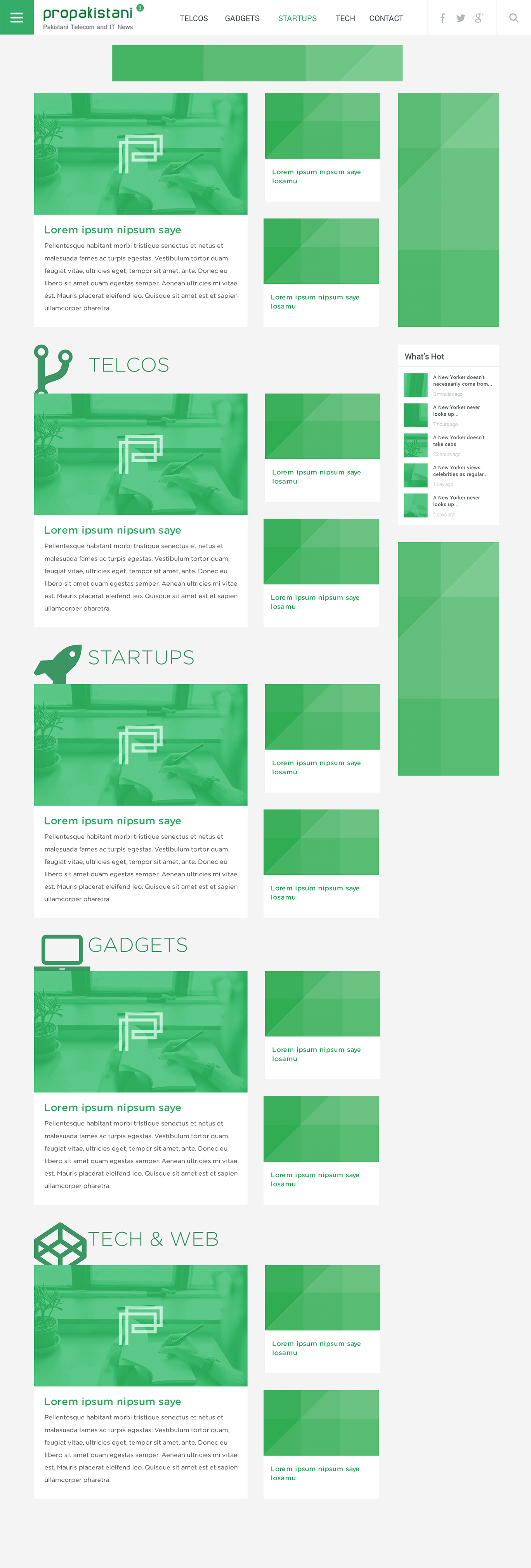
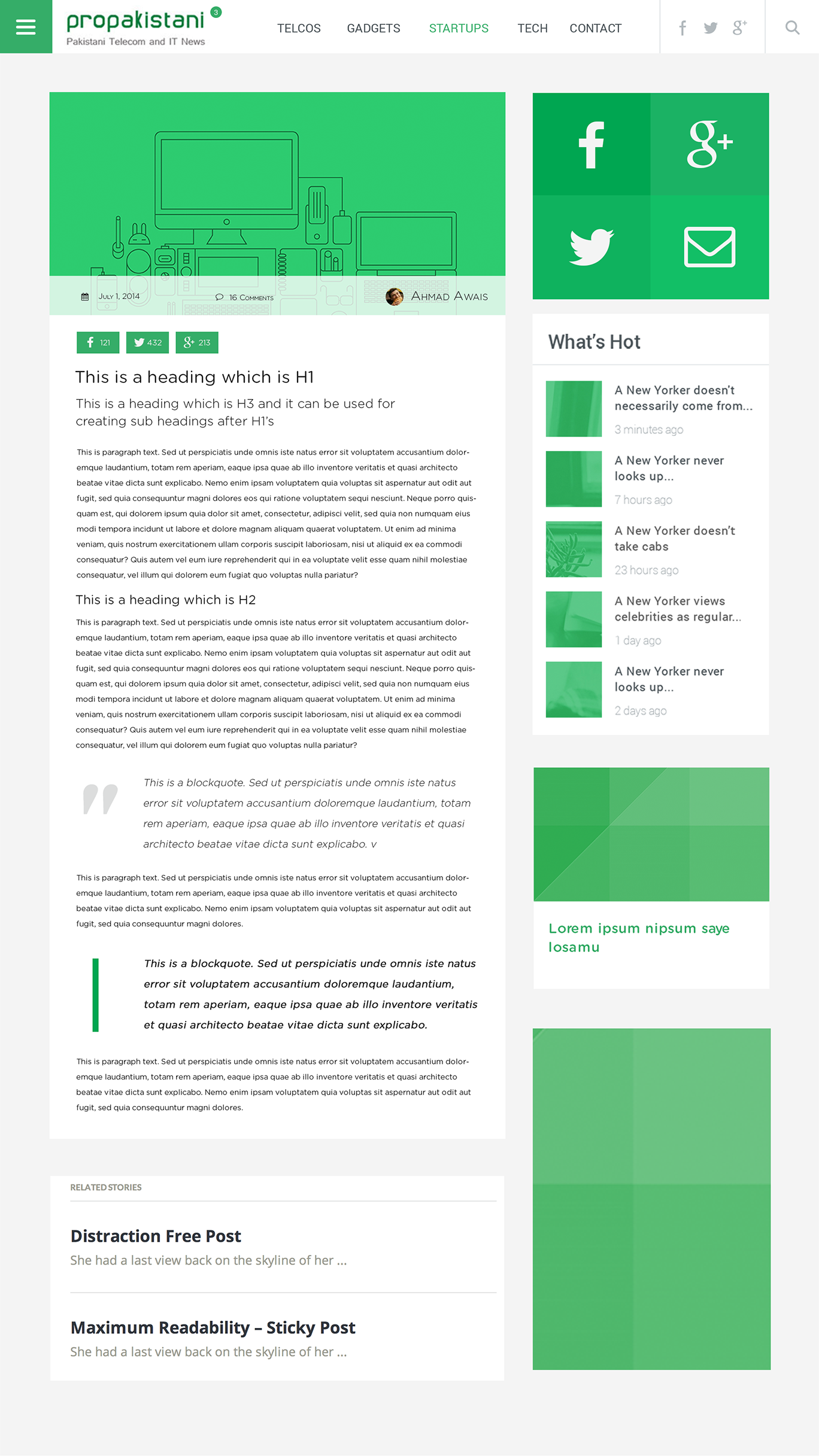
Homepage layout ( See the full size image )
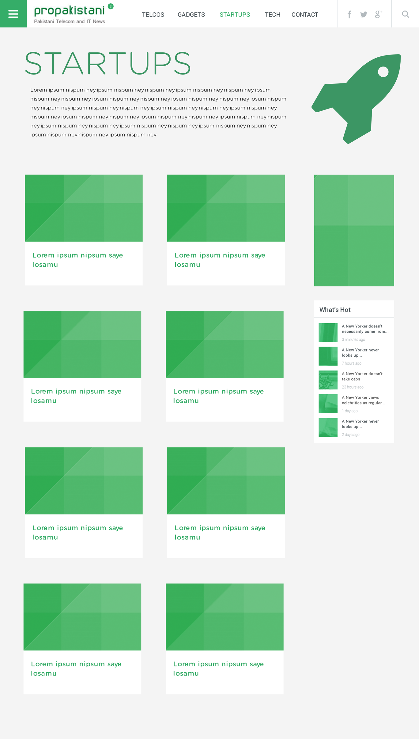
Category Page layout ( See the full size image )
Single post page layout ( See the full size image )
Step # 3: Development Phase
Some of the major challenges in the development phase were tackling with navigation bar, improving the factor of page speed and a complex responsive design for all the major smartphones, tablets, laptops and desktop computers. We targeted about 18 different devices. Creation of true responsive layout was subjected to a good deal of research, I mean look at the homepage. There were 18 different devices which were about to display the homepage in a seamless fashion to keep up with the readability factor and still keeping things in accordance with the design aesthetics above.
Responsive design
We set to create a true responsive design for 18 different devices and their latest browsers (The time & budget constraints kick-in here, so, we had to limit the development up to 18 devices). One of the strongest challenges here was Home Page Layout. Development team continually collaborated with a designer to create about 4 different layouts of Homepage addressing different screen sizes of Smartphones, Tablets, Laptops & PCs.

Reading is believing
To address the readability factor throughout our responsive development phase we gave more and more space and bigger font sizes.

Sharing just got simpler
Instead of render blocking JavaScripts of different social media platforms we decided to build a custom API, which collects and caches the number of shares for each post. Keeping things simple yet making the page speed enhancements added a good deal of value to the user experience.

All your favorite categories in one place
Not only is it the latest trend but it helps a lot in UX to have an off-canvas navigation bar.

New posts in last 24 hours
We thought of implementing atleast one feature which was never seen before at ProPakistan.pk, it was a simple but intuitive notification bubble, letting everyone know about the number of posts published in last 24 hours.

Creative 404 Page
Last but not the least, there is a funny 404 page. When you end up browsing a page at ProPakistani which is no more available, you get to meet our pet made in CSS3

And the Social Profiles Branding
Each and every aspect of a brand should follow the same aesthetics and philosophy. We did the rebrand of ProPakistani in a complete 360 degree fashion.

2 designers… 3 developers… 3 design rejections… 7 Quality Assurance & debugging rounds… 23 meetings… 231 cups of tea & coffee… 293 logged hours… led to the version #4 of ProPakistani.
P.S. At the end of the project, ProPK team decided to modify the font from the sleek Gotham Rounded premium family to two different thick fonts and certain other spacing amendments, which me and my team are not accountable for.


Nice Work… lots of efforts and creativity (Y)
ProPakistani Always Inspire me… How you can Get Dedicated Audience with Quality Content.
Respect For Aamir Bhai who is providing us such a informative platform.
Great Work from Ahmad Awais and his team (Y)
Thanks Nouman Younas.
Could you tell me which languages are used to make it? HTML etc?
HTML5, CSS3 with Saas, JavaScript, jQuery, PHP.
Other scripts like fb-floo, Grunt setup for optimization of images, js, scss etc
A little bit of JSON, CURL etc.
Thanks! I am going to learn them all..!! What about CodeAcademy website where I have done 60% HTML5&CSS, I mean, will it make me the same expert as you if I learn the all languages as you mentioned above from CodeAcademy?
It is not about learning languages. It is the least of your worries. It is about implementing what you know, experimenting, completing complex projects and keeping yourself up to date with the latest trends in inthe web industry.
I suggest the Complete Web Developer Course on Udemy by Rob Percival.
It takes you from the very basics of HTML through JavaScript, jQuery, PHP, mySQL and up to complete Mobile Applications.
And you get free web hosting. It is however, a paid course and you can get it for $10 on sale.
my only question where are RSS feeds gone I am not able to found link to RSS feeds.
Check the footer, there is a subscribe bar, you can subscribe from there to get new & branded Newsletters.
but these are email alerts whereas I am talking about RSS feeds .. RSS feeds feature is removed in new design?
You can easily enter the site URL in any feed reader and it will subscribe the feeds. Since Google is letting the feedburner’s API go sooner than later.
nice website and chick look! Welldone!
Ah, you promoting your company, great science. I know, there was deal for this post + the service fee. ;-)
As per professional point of view, there are still updates needed, like too big font-size (even bigger than the header at top)
In my tablet why there is gap, which slides to the right?
Front page look spammy in tablet. Need to actually search for the links under the big picture, too bad.
Please dont mind, but it doesn’t look professional and has bugs in it.
Thanks,
Nah! I didn’t even mentioned my company here. Wrong assumption. :P Even when I had complete right to and allowance from Aamir bhai.
Regardless of your deal with propakistani, Ahmad, can you provide a rough estimate on how much would it normally cost to build a site like propakistani’s or something which is a bit more advanced than it?
Hey Gibran,
You can contact me through AhmadAwais .com/contact and let me know about the details. I’ll get my Business development team to prepare a proposal in accordance with your exact needs.
About the spamy look, it is due to font.
I mentioned:
P.S. At the end of the project, ProPK team decided to modify the font from the sleek Gotham Rounded premium family to two different thick fonts and certain other spacing amendments, which me and my team are not accountable for.
I don’t think so, the thin fonts were illegible (at least for me) and they made the theme even look more “big-ish”. On the other hand Roboto looks much better.
Roboto is no where near better. The design was made for Thin Fonts, changing the fonts after design is a death blow to design aesthetics. Compare Propk.worwoxgroup.com with ProPakistani.pk and you’ll find the evident difference. If you don’t involve some designers with about 5 years of experience and collect their advice.
There will be hardly any designer who’ll prefer ro Robot over Premium Gotham Family.
If you would have told that this site has been redesigned by one of the well known foreign designer and developer, You might be gone crazy in appraising the design :)
Thats the Problem with us, Pakistanis!
Well Done Ahmad (y)
Though there are some modifications needed and needed badly but overall good work.
No, I would be the first one to put critics on the foreigner approach, I am polite because these are Pakistani designers. We have some great talent, compared to USA and others. :-)
There is always room for improvement pa g. Thanks for your comment.
#ThankYouWais
Loved it .. a complete new fresh feel. Congratulations and all the best for future.
Awesome new design, esp the biggish everything :) Good work Ahmad.
Thanks Imran. The bigish is new thing these days.
Great job guys ,no doubt its beautiful design and responsive part awesome. Only few suggestions when scroll down , right part of the page becomes empty and it doesn’t feel right .Second in mobile view it would have been cooler if menu slides from top to bottom . Its my personal opinion no harm intended.
Keeping one and only one workflow is important. It helps decrease the learning curve for end users. That is why we kept the same sliding menu from the left over the sapn of 18 devices.
As long as we talking about learning curve , isn’t it odd that Menu button moves or slide from one position to another when click, it takes extra learning/effort to move cursor and close the menu. Propakistani is all about news/tech so a lot of reading, empty spaces (specially on right side) , can mess your experience. just saying
More spacing can never mess up the experience. Bad spacing can. Spacing over different areas were amended after my team delivered the project. Can’t advocate on it.
Nice Work… Though, I see an inspiration from WIndows 8….
Obviously, flat came from there and from few other major brands.
Me & Aamir bhai , i started working at an internet cafe 8 years back when i met aamir bhai, it was his friend’s cafe … we had long discussion about IT i used to ask him silly questions about IT(as i was a kid :p) and he always treated me with patience :p .. IT was my passion and he always encouraged me, then he also gave me a chance to write reviews on games for pro-pakistani. He always supported me when i was exploring this field and today i am an online marketing head in reputable company and i am proud to say that he was one of the best mentors i came across through my career. i never had a chance to say how thankful i am to him, so today i am saying thank you Aamir bhai… i always knew this guy will do something big someday, when i met him there was no propakitani i believe, or if there was, i wasnt aware about it :p ….. So i wish you all the very best in future, loads of success, happiness and much much more bro .. Cheerz Aamir bhai….
the new design is not worth it. Previous one was alot better.
Change is a thing very hard to absorb, but within few days everyone will be use to this new designs . Fantastic work Ahmad . I can understand how hard it is . You and your team did a great job .
One Thing I would suggest to ProPak team that on homepage reverse the hover color effect , keep the headings dark colored and hover color in the Brand Green . This will greatly enhance the visibility factor and page will not look too white .
ProPK team intentionally kept it too white. We started from #dedede the light grey. And kept decreasing it until unless the lightest possibility of gray color was achieved. Can’t say, didn’t had a say in it.
Good Work every thing look so perfect except logo :)
The mobile sites are good, but the desktop site looks rather blown up, The menubar is too big, photos are out of proportion and lots of empty space for nothing. This how this article looks in full screen mode and note that most people don’t have this much real estate on their browsers
The redesign is really good especially the mobile sites, but the desktop site looks rather blown up, The menubar is too big, photos are out of proportion and lots of empty space for nothing. This how this article looks in full screen mode and note that most people don’t have this much real estate on their browsers
What’s the issue in your image?
did you even read my comment?
Yes, and you said the desktop version is blown up. Whereas I can see nothing wrong with the shots you posted. If spacing concerns you? Then I did mention that fonts and spacing were modified by ProPK team after we delivered the project.
I just checked out the link you posted and thats perfectly fine. But there still are a few key differences e.g. the author name & date are posted on the image not below. and it kinda is your fault for not leaving space for ads. How do you expect they’d run it?
And to the proPK team: Guys! revert back to this guys original layout and fonts, its much better
It is a part of design. It is called overlays. It is not a fault. The theme is widgetised in accordance with the guidance of ProPK team, so they can place ads where ever they want.
photos out of proportion? :/
As far as I read the article, the new design is to keep up-to-date with latest trend. “Bigger and Flat”
Personally, I have tested ProPK new design on variety of devices and there is no issue with spacing, as they are responsive, which appears to be very hard to understand for many.
No no no you’re missing the point. The new trend isn’t “Bigger” its “Bigger content” & by that we mean focus on the content. Look at my sreenshot, the content is not to be found I have to scroll through a complete page for that.
Thats what I am saying it is opposite of “responsive” its essentially loading the mobile site on a 15″ desktop display not responsive at all!
Believe it or not this is what many people aren’t liking the new design
Your comment about the 15″ desktop size is interesting. Can you elaborate more especially if you have any statistics for that wrt Pakistani market?
I meant desktop as in “desktop site” or “desktop OS” not a real desktop computer. (Screenshot is from a 15″ Macbook Pro.) I expect it will look even poor on smaller displays with even lower resolutions (like the common 1336*768).
TL;DR The desktop site should be more optimized, not a bigger mobile site
My concerns precisely since most desktop display resolution is 1336*768 (even on the 19″ monitors) or lower or people have the smaller 15″ laptops!
If you have any figures on which screen size is prevalent in Pakistan, would appreciate that!
Yeah 1366*768 is the most common resolution here from laptops of 13″ (courtesy shahbaz sharif) to 17″ LCDs. 19″ Inch are mostly higher then that though
Medium .com is one of the most trendy and readable sites these days. In 99% of cases they have only one image and it’s heading above the fold. Which blows your wrong philosophy out of the water. Check it out.
Medium is a site meant to just down and start reading for like 5-10 mins. Its like a short book and they have designed it to be like one. Your site is a tech blog compare yourself with other bigger tech blogs like theverge or techcrunch or cnet or engadget or gizmodo or recode or anything!
You are quite sadly mistaken. Images are the part of content. If you consider text to be the content thing only I wonder how you explain the homepage of Google and Facebook.
Again they are not tech blogs!!!! Facebook and Google make money off your photos, they need you to focus on photos more! But photos are not the focus for you! they merely help the headline thats all. again try doing like the other techblogs. don’t blindly follow whatever website you like, they have their own goals you have your own
oh and by the way you do remember why Facebook pulled back their bold new redesign (the one with the big photos and all)? ans: people have big screens with low resolutions!!!
See this. Tech Crunch one of the biggest tech blogs.
I am sorry I didn’t mean to sound arrogant at all. I really appreciate that a Pakistani tech site is built on a very modern design and backend infrastructure. You guys did a fantastic job and I don’t mean any negative criticism, trying to be as constructive as I can, just want to help improve it a little thats all.
Try techcrunch and you’ll find only images above the fold. It is how it is.
On the other hand of you go take a look at ProPK.worwoxgroup(dot)com then you’ll find a major deal of difference. ProPK team is using ads. Which obviously blow up the design aesthetics. But on the other hand they are necessary evil.
Nice way of self promotion!
Details are fine but there are lots of unnecessary details about your company and how you work(definitely in hope to get new project from this promotion)
Read the title. It says “How me and my team re-branded ProPK with a new design” so it is not about the design, it is about how we did it. Had it been about design or dev none of you would have understood it, coz of the complex details which are not really good once fed to laymen.
Self promotion? I didn’t even mention my company’s name here. Face palm!
Great stuff Ahmad Awais and team! Love the postscript :D Poor old sleek Gotham rounded.
Thanks Asad
Some things are better left as classics. The classic design previously gave great visibility and clarity. I am frustrated and annoyed by the fact that my favourite website ProPakistani looks like a mess now. I wish the previous design could come back. Hate this one!
Guess what? Readability should be the biggest feature of a blog design. I would love to know how did you address that, if at all. Eye candy almost always eclipses readability. And pro Pakistani did just that. Readibility is judged by the first glance – how it meets the published content. Making everything big does not magically make a blog design readable. Havent you heard that size does not matter?
You seemed to be quite confused. Try the demo and which we delivered Propk.worwoxgroup.com. Then compare it to the present version. I didn’t agree over the font changes, and I believe it is the reason of your comlain.
great work, i really like new design!
Thanks @zakiuddin:disqus
There should be a poll about the recent design vs previous design.Just my suggestion.
I guess you didn’t even read the article. It says “Neither I or the ProPakistani team have any plans to ‘crowdsource’ feedback, but this is a rare opportunity, one can get, to talk about some of the decision-makings, and yet I’m a big fan of transparency.”
Good effort and great redesign. Ahmad’s design philosophy is really awesome.
Thanks for the appreciation @faisalbasra:disqus
I am really impressed with the design as I tested it with many ways.Speed is too good & the design is user friendly & smooth.All hail to @Ahmad Awais . Keep it up
Thanks for that @muhammad_tehseen:disqus
How can I read the older posts ?
Not cool at all. Every thing is so big as to leave very little information on the screen at any given time. Very difficult to browse through the post as article category, pictures and titles are huge and require to scroll down too much to get to other posts. The top info bar should not be visible at all times as it is taking too much space. It should appear only when mouse is rolled over that space. The elements on the screen seem inconsistent and do not give the feel a whole website, rather they appear distinct scattered pieces.
This is what we call Responsive design. Welcome to 2014.
Amazing design! I liked it.
You guys are awesome. May GOD bless the ProPakistani Team.
Thanks @zohaibjahan:disqus
Simpler is always better. Previous design was much better
Simpler is better. Previous was simpler, yet old and childish in a lot of aspects.
Old design was much better. This bigger design is bad for desktop viewers. I want old design back and if its not so then I will stop coming to this blog.
You guys really like Anime, i see. :). But do know that the tree spirits of Spirited Away are Studio Ghibli property (404 Page). Would suggest you change them a bit.
Oh man, a 50$ themeforest theme could have done a better job!!!
Why don’t you buy one for ProPK? Come on guys! Stop bullying/degrading the designer. He did his job pretty good.
They would have bought a theme like the earlier one if it had done the job. Think why they didn’t? There is your answer.
Can you guys please reenable RSS.
Hmm you are right about font here, also you are right to say that you can’t do anything if the client is not willing to do that. ;-)
I myself a web & software developer, working as a freelancer. I do advice Aamir to give designer the chance.
One more bug by the way, discuss name, email boxes shrink to fit the box here in small screen like my tablet
@ahmed habib you totally get it.
Disqus is a 3rd party tool. It is just embedding itself.
Disqus is though 3rd party but when you use it then it should be well matched to your theme, if not I am afraid it will further make the design silly.
Like you wear shoes of bata, but put in lases from a local manufecturer, it will simply destroy the look of bata.
Disqus is looking just fine. Most of the major blogs worldwide are using it. You have a personal dislike for its platform, where I can’t help.
Great job but the title has incorrect English, it’s not how me and my team it should be How my team and I ……
It’s ok to break some grammar rules if 99.9% people are doing so. Moreover, grammar rules also change with time. I read many grammar rules in F.Sc but I don’t follow them because I see them breaking every where even by the native English speakers. For example, there is a grammar rule that you should not start your sentence with “Due to”. But I see native English speakers do not follow this rule so I also don’t care.
The new design of Propakistani is amazing. I loved each and every thing about it. It now actually looks like a high-end professional blog. Previously, the design was something like a single-person run blog. Now, it actually looks to have a complete dedicated team behind. Thumbs up for keeping pace with the growing IT trends of the modern era…
I wondered to read the comments of the people here saying that they liked the previous design more. Aren’t they following the top-end blogs of the modern era? What kind of lame excuses they are uttering to support their backwardness. For example, one commenter said that he had to scroll a complete page down to start reading the content of a post. The answer is, just open a post of the top-end blog Techcrunch (with the global ranking of 299) and see there also you will need to scroll a page down to read the content of a post.
And some comments are saying that the author of the post is trying to promote himself and his company, etc. First thing is that this claim seems to be baseless. And second thing is that I think there is nothing wrong in promoting yourself if you really worth it. Instead of expressing your jealousy, you should come up with something so that you can also promote yourself.
Thanks.
Thanks for the appreciation and intellect.
I didn’t even mention the name of my company. People are like this, the captivity of negativity is a strong thing to let go of.
The new design of Propakistani is amazing. I loved each and every thing about it. It now actually looks like a high-end professional blog. Previously, the design was something like a single-person run blog. Now, it actually looks to have a complete dedicated team behind. Thumbs up for keeping pace with the growing IT trends of the modern era…
I wondered to read the comments of the people here saying that they liked the previous design more. Aren’t they following the top-end blogs of the modern era? What kind of lame excuses they are uttering to support their backwardness. For example, one commenter said that he had to scroll a complete page down to start reading the content of a post. The answer is, just open a post of the top-end blog Techcrunch (with the global ranking of 299) and see there also you will need to scroll a page down to read the content of a post.
And some comments are saying that the author of the post is trying to promote himself and his company, etc. First thing is that this claim seems to be baseless. And second thing is that I think there is nothing wrong in promoting yourself if you really worth it. Instead of expressing your jealousy, you should come up with something so that you can also promote yourself.
Thanks.
Thanks for the appreciation and intellect @Abdullah Khan.
I didn’t even mention the name of my company. People are like this, the captivity of negativity is a strong thing to let go of.
Well Done Awais, You have done a really great job :-)!
Thanks for appreciating the efforts.
Strange to see childish responses given by this so called jack of all master of none(self promoter) *designer and his team*, first of all this is very rude to call the previous designers work “childish” as any one can see who is replying in a childish manner..also clearly people are showing praise for the previous version no mater how you degrade it with your illogical points (by the way you are failed to answer all the criticism on this design positively) so better to accept the failure of this design and accept the previous design as WINNER!!!! I guess Aamir atta should get an immediate refund too.I would like to know who the previous designer was?He need to redesigned this again for all of us the propakistani old fans.
The previous design is a good friend of mine. His design was changed too. But believe me when I look at what I had been doing two years ago, I call it childish too. Why? Trends wear of within an year or two. Same will be the response of that Designer over his old design. It was never meant to disrespect him or his design.
right.. i agree with u…
Please also increase the type size of ProPakistani. The present default type size of text in the newsletter is so small that one can read only with a magnifying glass.
On this page, you could reduce the type size and the interline space. The change will mean easier reading and much less scrolling.
Redesign should have also changed the name to indicate relationship with telecom. The present name suggests a web site to promote patriotism!
Or mery bhai ya ProPakistan ka sath gool diary main 6 kyou likha hoya hai??
شیخ صاحب آپ نے شاید یہ آرٹیکل پڑھا نہیں ورنہ یہ سوال نہ کرتے۔
New posts in last 24 hours
We thought of implementing atleast one feature which was never seen before at ProPakistan.pk, it was a simple but intuitive notification bubble, letting everyone know about the number of posts published in last 24 hours.
this design is good for touch devices not for desktops and laptop.. if you design it with bootstrap its look nice in big resolution and pixel perfect,,
Bootstrap is for copy paste programmers, who cannot use CSS3 on their on and is full of bloat.
haha,, good joke.. so why all world using bootstrap.. you make a crap and now you are defending it with lame excuses…
Those who can’t code in a standard way use Bootstrap, which was made for bootstrapping not for designing. But hey why would a guys with manners of calling a counter argument with ‘make a crap’ understand that. P.S. Use Google, if not your brain.
http://mashable.com/ see this how clear it is…
Seriously? You are comparing it with ProPK. LOL. Do you know what was the budget of it’s redesign? Mashable’s redesign was a hefty code rewrite which ended up with ROR. Stop yourself right here. Use Google to learn about it.
Old one was good. This design is even bigger on my 43 inch LED (Resolution at 1080p)
And I have seen a similer design on themeforest
Can you share the themeforest link?
Theme was coded from Scratch. So, your notion is wrong.
Looks like these is again redesigned? :/