The compulsion to follow modern design philosophy is perhaps the most acceptable thing in technology. Using bad design in the name of modernism certainly isn’t.
I really am not grasping the all white concept in Instagram's new design. So you put less thought into the layout and call it an update lol
— Brittany Renner (@brittanyrennerr) May 12, 2016
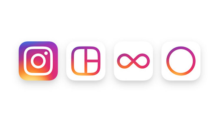
Instagram has unveiled its new logo moving forward, a move which is clearly different from the retro looking camera that you’re used to seeing. As it turns out, the effort is almost certainly not guaranteed to go down as one of the most undesirable design changes.
The old, sophisticated logo is replaced by a flatter theme (expected) with white outlines that resemble a camera (barely). It is so uncomplicated that it can easily find its place in a kindergarten class but the question is, do you really want that?
Not gunna lie not diggin the new Instagram. Looks like Windows 95 lol.
— STOFF (@realdstoff) May 12, 2016
The Facebook-owned company maintains that the older logo was not exactly “reflective of the community”. That was followed by the attempt to “modernize” the old logo, which clearly didn’t work given its complex nature. In the end, it all came down to an abstract element with rainbow colors for the background that lead to what is being aimed as a foundation for many, many future designs yet to come.
Not only that, Instagram is also overhauling the app design to allow the content to speak more and the buttons to be less intrusive. The bold black and blue bars at the bottom and top are replaced by white ones with black tags and buttons. No new filters are being announced as a part of the scheme. This change is not as difficult to back as it gives more space to the most important part of the Instagram experience, the community.
Instagram's new interface is disgusting.
— Nazu (@nazuksuratehaal) May 12, 2016
It is turning quite cliché to criticize each rebranding effort undertaken by a major brand as either boring, unimaginative or unsophisticated, often all. The fact why this one matters so much is that the old logo has come a long way to signify that the app wasn’t just a backyard effort by a few developers shouting “me-too”. Coming a long way, it became as much a part of the experience as the social-networking part of the app itself. It deserved better.
If this is the groundwork set for future overhauls of the app, it honestly is a bit difficult to back.


Do I give a rat’s fuck to what internet hates or loves?
Propakistani’s own new design suxx big times than Instagram. Change this shiiit soon.
Haha.
I also hate the new interfere of ProPakistani, that’s why I’m using it on Disqus app
Totally Agree.
We Want ProPakistani’s Old Design Back.
Bhai yeh jin logon ki tweets aapne quote ki hain, yeh kia random hain ya phir in logon koi taluk hai instagram se?
inka talluq yeh hay .. k yeh instagram kay users hain ! :P
How the new Instagram logo was designed :)
http://imgur.com/gallery/orfokqy
Brittany Renner ki DP to dekh lete uss ka tweet quote karte huway article writer sahab .. she looks naked