
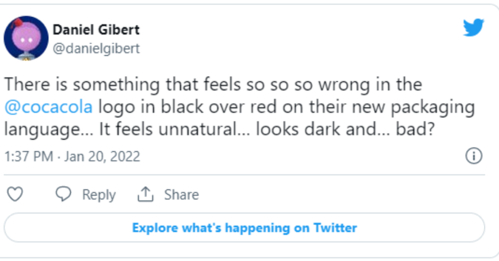
Coca Cola reveals a new packaging design that is recently the talk of the internet. For a brand as well known as Coca Cola, redesigning the packing, without compromising its uniqueness is a little tricky. Coca Cola modifies its packaging and reveals a new design and response from the public is making it hard to decide if it’s a smart decision or not. The company has recently unveiled the look of flavored Coke products. The core focus of the brand is to raise the excitement for its core beverages. Many people claim that the new packing design of Coca Cola increases its chance of getting lost in the crowd and has taken away the distinctiveness of the brand.
According to the brand, the aim of redesigning is to make the flavors easily differentiable and recognizable. “We wanted to modernize and simplify the look of our packaging to help consumers find the flavor they’re looking for on the shelf through a colorful but clean packaging design,” said Natalia Suarez, senior brand manager of Coke Choice Portfolio. However, the reaction from people reveals the opposite.
The “Modernized & Simplified Packaging”
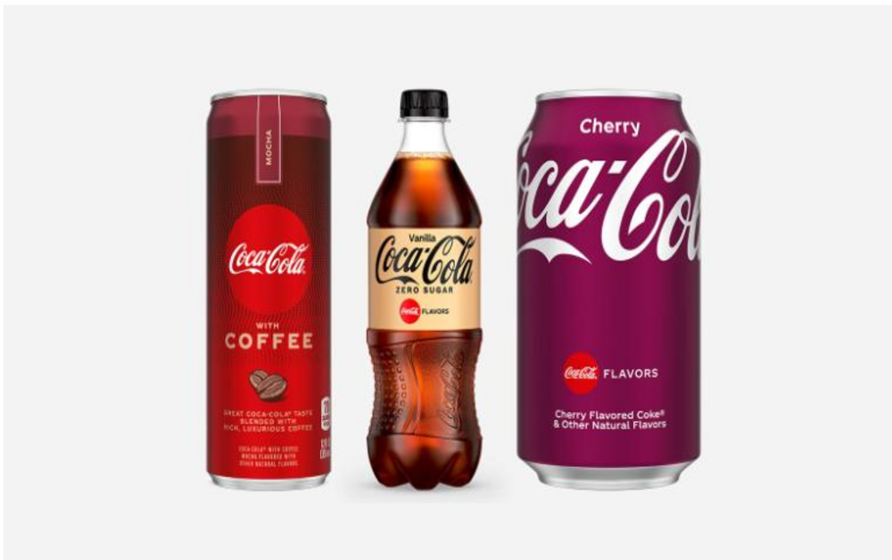
The entire range of Coca Cola beverages has been subjected to a brand-new packing design. In addition to that, the brand also launched a new flavor, Mocha. The remodeled Cherry Coke cans and bottles are magenta in color. To indicate zero sugar or full sugar, the logo is either in a white script or a black script. Where white script represents regular coke (full sugar), the black one represents zero sugar. This, according to some people, has made things more complicated than easy. That is because Cherry Coke has a black logo on a dark purple background and Vanilla Coke is white on gold. All in all, the people are still confused!
Furthermore, the brand uses full colors to designate “single flavors” and stacked colors to represent “dual flavors”. For instance, Cherry Vanilla is a white gold stacked above dark purple. This “modernized and simplified” look has clearly not received the intended response. People feel that the choice of colors of the packaging is anything but minimal. The long-term response is yet to come but as for now, it seems like the customers are not very happy with the remodeling.


 Restaurant Reviews
 Video Reviews
 Kitchenware