Softoven redesigns ProPakistani.pk
I felt privileged when Aamir Attaa reached out to me to redesign ProPakistani.pk.
“I want a design that’s aesthetically pleasing and user-friendly. Something different, something that’s never been done before.”
Pleasant aesthetics, friendly UI and something that pushes boundaries? That’s our forte. So me and my team brainstormed for a few days and accepted the challenge.
Being a regular reader of this very site myself for about a decade now, I have a good understanding of ProPakistani as a publication. I have also been looking at the site with a critical eye so had a good idea of the shortcomings of their interface and the pain-points their readers faced.
But intuition doesn’t translate directly to good results. So we decided to interview ProPakistani’s editorial team and some selected readers to learn about their pain-points and their respective ‘wishes’ for their favorite technology website.
While conducting research, I encouraged people to think beyond constraints. I asked them to think of the things that don’t appear feasible, of ideas that they had given-up on because they were too big. This helped us a lot!
And the list of what-ifs kept growing. When we analyzed this wishlist, we realized although you don’t expect such features from a regular Pakistani technology publication, it was all very doable.
We scanned dozens of top ranked international news sites and noted their best parts on our Trello board, then filtered them to narrow down to the ones most relevant to our context. The fun part? We were not looking at any constraints, we pushed the limits of our research and learnt that the best sites:
There are a lot of tools that we use depending on on the requirements of a project but there’s no alternative to classic pencil sketches.
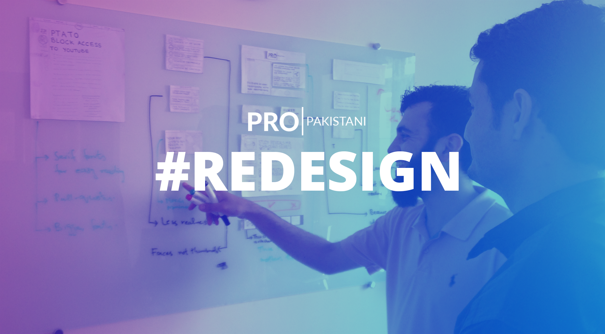
When I pick up a pencil and paper for something, you know my heart is in that one. Along with my team, I created different components of the interface that I would then arrange on a glass board.
Here came the domain experts from ProPakistani i.e. the editors and the stake holders. We had an awesome time together discussing the placement of breaking stories, featured stories, editorials, press releases, advertisements and every single object on the home page and rest of the site. After several meetings and iterations, we decided on the placement you currently see on the site.
Modern web is slowly adopting serif fonts again after being out of vogue for over a decade. We now have fonts that have serifs but still render well on all types of screens. When you are reading, you are naturally paying attention to the text. In such a context, serif fonts don’t let your eyes switch lines and skip words and you can easily keep on reading lengthy paragraphs of text.
Headings, on the other hand, require a split-second attention from the reader. Look at the heading and you should be able to read it even when you don’t have much intention to do that. Here you need a font that your eyes can absorb easily. Non-serif fonts have this ability so we went with Open Sans for titles.
About 50+% of ProPakistani readers access the site from their mobile devices. So a mobile site had to be a first class citizen unlike its current status. The difference on mobile is that scroll is an intuitive behavior. You need to present consumable info above the fold but don’t need to worry too much since we have a good playground below the fold as well.
Following the same principles, we presented most important stories above the fold and stacked the rest below it. Our phone screens are the new DHA, you have to be cautious with use of real estate. So we had to let off a few less important types of posts on the phones for the good of readers. Coming from a mobile device, you’ll get a lot more editorial love.
I feel privileged to have a competent development team complementing our design excellence, who built the site in a fair amount of time. That doesn’t mean we weren’t comprehensive.
Weeks after weeks were spent in the pursuit for perfection. Whether it was a paragraph that needed a 2px additional line height, a pixel bigger font, the ad to have a pixel as padding on either sides, it was a process that went on seemingly forever.
I was fortunate to have Aamir Attaa who has a keen eye in addition to a perfectionist like myself. This cascaded quality check allowed us to deliver a site that breaks on hardly any responsive width, has fewer than ever design flaws and we can safely say, is one of the best site designs you’d have seen in a while.
We have put all the love we could humanly do. But if you still have some ideas or suggestions, feel free to drop us an email team [at] softoven.com and we’d love to fix it.
Awais Naseer is the CEO and Creative Director of Softoven. He’s a designer at heart and a startup consultant and product strategist at soul. He regularly shares startup tips under the umbrella of Startup Oven.