I felt privileged when Aamir Attaa reached out to me to redesign ProPakistani.pk.
“I want a design that’s aesthetically pleasing and user-friendly. Something different, something that’s never been done before.”
Pleasant aesthetics, friendly UI and something that pushes boundaries? That’s our forte. So me and my team brainstormed for a few days and accepted the challenge.

Research & Analysis
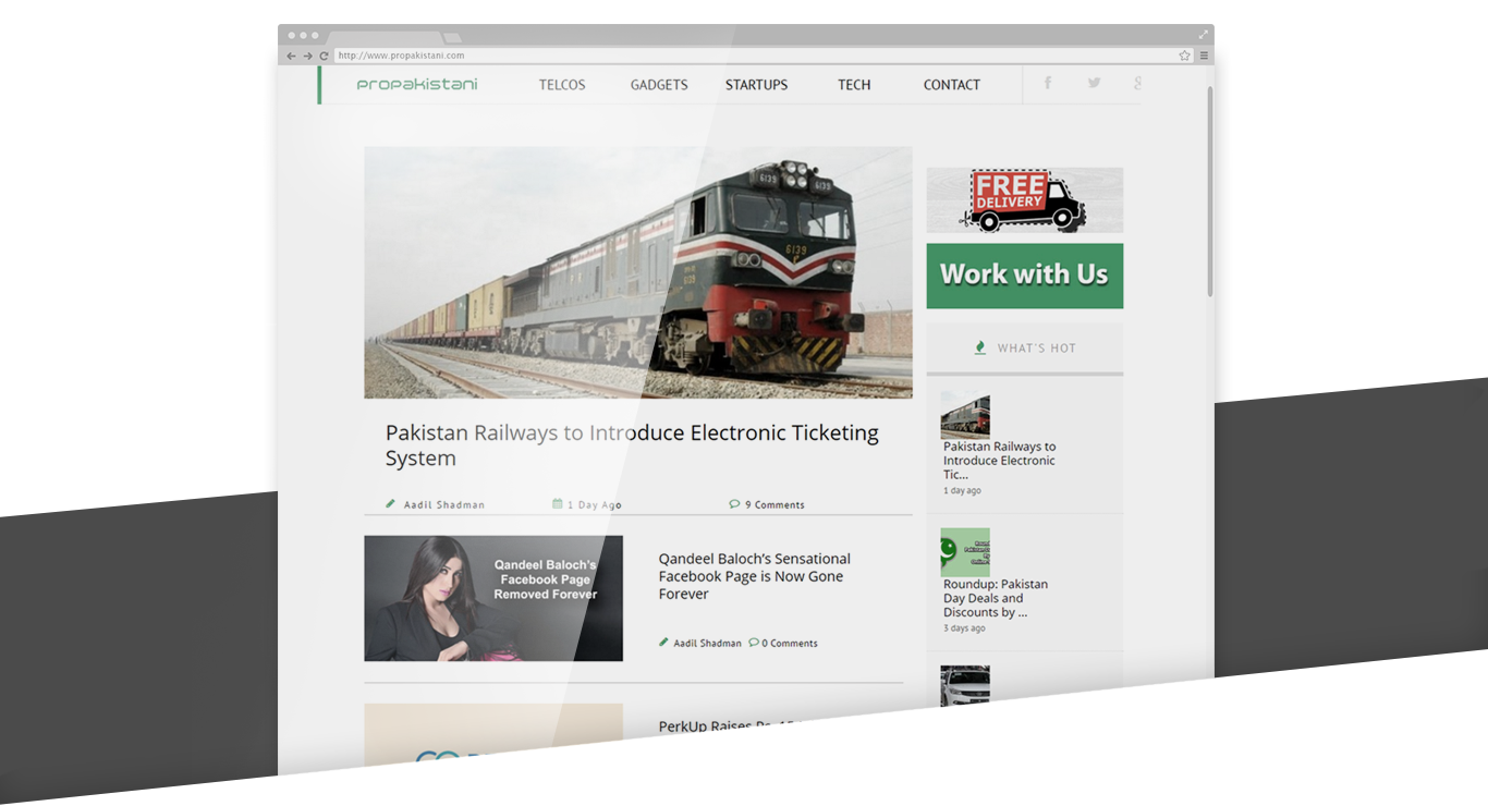
Being a regular reader of this very site myself for about a decade now, I have a good understanding of ProPakistani as a publication. I have also been looking at the site with a critical eye so had a good idea of the shortcomings of their interface and the pain-points their readers faced.
But intuition doesn’t translate directly to good results. So we decided to interview ProPakistani’s editorial team and some selected readers to learn about their pain-points and their respective ‘wishes’ for their favorite technology website.
While conducting research, I encouraged people to think beyond constraints. I asked them to think of the things that don’t appear feasible, of ideas that they had given-up on because they were too big. This helped us a lot!
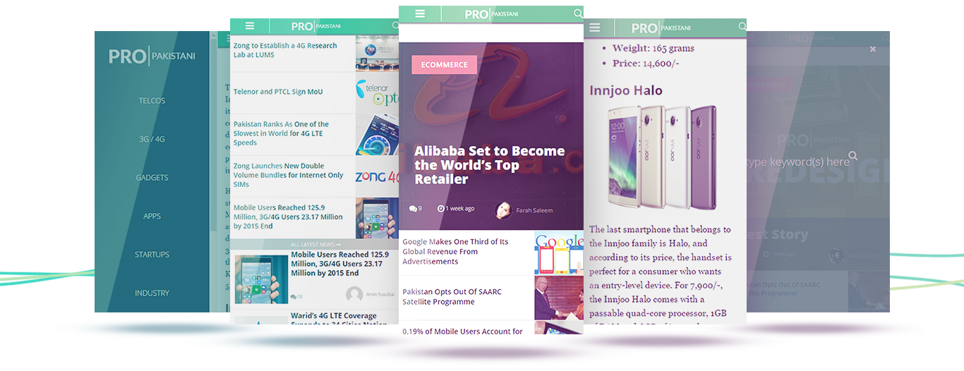
- What if we could have diagonal images and better looking quotes?
- What if stories without thumnails still appear great?
- What if a red ‘Breaking’ badge automatically appears when there’s a breaking news?
- What if there’s a nicely placed badge that says ‘Sponsored’ for any such stories?
- What if we could hook the readers even after they have read a story of their interest?
- What if we could present loyal readers with a near ad-free experience?
- What if we could present tailored content to the readers?
And the list of what-ifs kept growing. When we analyzed this wishlist, we realized although you don’t expect such features from a regular Pakistani technology publication, it was all very doable.
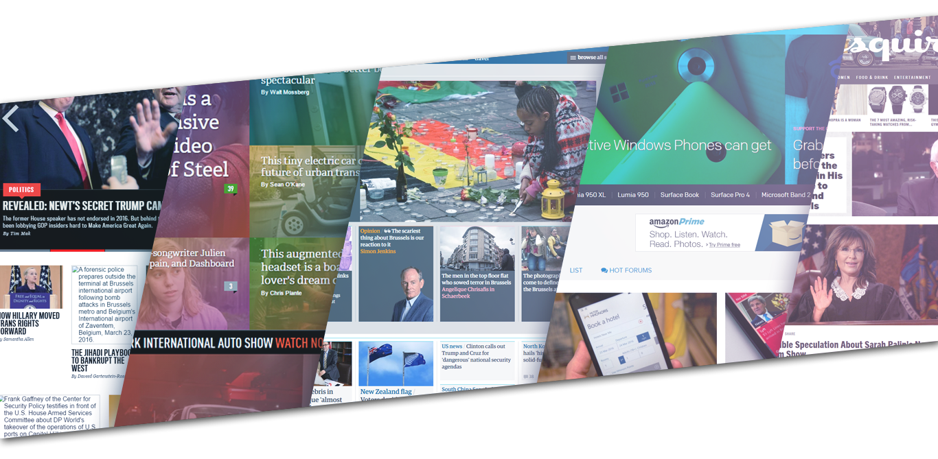
We scanned dozens of top ranked international news sites and noted their best parts on our Trello board, then filtered them to narrow down to the ones most relevant to our context. The fun part? We were not looking at any constraints, we pushed the limits of our research and learnt that the best sites:
- Present more information on the home page above the fold. You get to see a lot of the important news of the day without having to click and scroll.
- Are either moving to paid readership or denouncing the ad experience in any other way.
- Show the most relevant stories to the readers throughout the site.
- Use better images to serve their users.
Experience Design
There are a lot of tools that we use depending on on the requirements of a project but there’s no alternative to classic pencil sketches.
When I pick up a pencil and paper for something, you know my heart is in that one. Along with my team, I created different components of the interface that I would then arrange on a glass board.
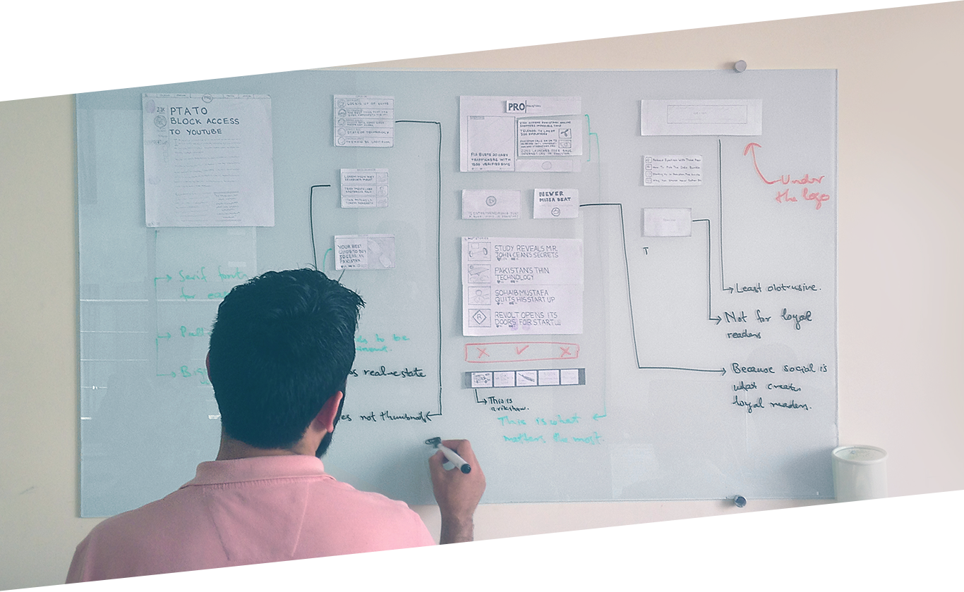
Here came the domain experts from ProPakistani i.e. the editors and the stake holders. We had an awesome time together discussing the placement of breaking stories, featured stories, editorials, press releases, advertisements and every single object on the home page and rest of the site. After several meetings and iterations, we decided on the placement you currently see on the site.
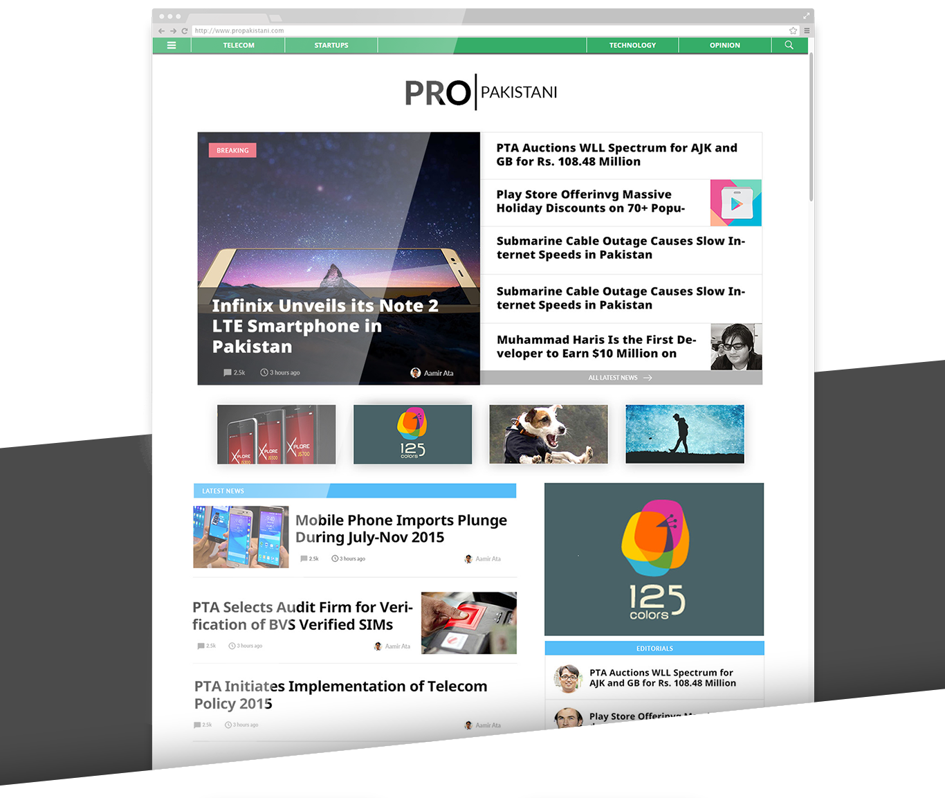
- The major problem we had on the main page was that a single feed of posts was not doing justice to the different type of content produced by ProPakistani. With every new published post, the previous ones went down. We had cases where the Editors spent a week on research for a story and it got buried in hours under a stack of press releases.
- We came up with sections, and kicked the right side-bar out of the house. That’s too old school and hardly helps in the contemporary design. Welcome ‘Editorials’ and ‘Press Releases’ sections on the home page. Editors have worked hard on a gadget guide? Welcome ‘Highlighted Guides’ below the fold. There are several stories that need to stay in spotlight? Welcome to the masthead area that can present a huge breaking story and five other important stories.
- What’s the point of distracting the readers with related stories in a sidebar when they are reading one story? Let’s give the reader a break and let them finish what they’re reading. Once they are done, show a relevant story so they can keep reading. Not interested? Scroll down to the comments. The engagement doesn’t end there. You get a feed of relevant stories after comments that keep loading till you scroll, ensuring you always have something to read next.
- ProPakistani covers a lot of different topics now. What if I am a telecom leader and interested in telecom news only? What if I want to read about startups and telecom doesn’t matter much to me? Welcome to the well-structured, aesthetically pleasing category pages that were non-existent before today. You can now bookmark a category page of your choice and visit just that every day.
Typography
 After a lot of brainstorming and discussions, we decided to go with a serif font for the content.
Modern web is slowly adopting serif fonts again after being out of vogue for over a decade. We now have fonts that have serifs but still render well on all types of screens. When you are reading, you are naturally paying attention to the text. In such a context, serif fonts don’t let your eyes switch lines and skip words and you can easily keep on reading lengthy paragraphs of text.
Headings, on the other hand, require a split-second attention from the reader. Look at the heading and you should be able to read it even when you don’t have much intention to do that. Here you need a font that your eyes can absorb easily. Non-serif fonts have this ability so we went with Open Sans for titles.
Responsive Design
About 50+% of ProPakistani readers access the site from their mobile devices. So a mobile site had to be a first class citizen unlike its current status. The difference on mobile is that scroll is an intuitive behavior. You need to present consumable info above the fold but don’t need to worry too much since we have a good playground below the fold as well.
Following the same principles, we presented most important stories above the fold and stacked the rest below it. Our phone screens are the new DHA, you have to be cautious with use of real estate. So we had to let off a few less important types of posts on the phones for the good of readers. Coming from a mobile device, you’ll get a lot more editorial love.
Development & Precision Testing
I feel privileged to have a competent development team complementing our design excellence, who built the site in a fair amount of time. That doesn’t mean we weren’t comprehensive.
Weeks after weeks were spent in the pursuit for perfection. Whether it was a paragraph that needed a 2px additional line height, a pixel bigger font, the ad to have a pixel as padding on either sides, it was a process that went on seemingly forever.
I was fortunate to have Aamir Attaa who has a keen eye in addition to a perfectionist like myself. This cascaded quality check allowed us to deliver a site that breaks on hardly any responsive width, has fewer than ever design flaws and we can safely say, is one of the best site designs you’d have seen in a while.
Final Design
We have put all the love we could humanly do. But if you still have some ideas or suggestions, feel free to drop us an email team [at] softoven.com and we’d love to fix it.
About Awais Naseer
Awais Naseer is the CEO and Creative Director of Softoven. He’s a designer at heart and a startup consultant and product strategist at soul. He regularly shares startup tips under the umbrella of Startup Oven.
Stay Connected with ProPakistani
Get the latest news, tech updates, telecom insights, and business stories wherever you prefer.
Add ProPakistani to Preferred Sources and see more of our stories in Google Search and Top Stories.


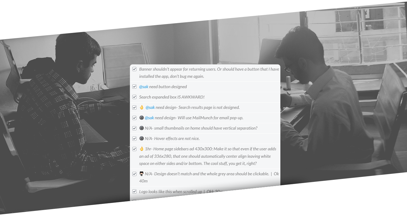
Boss images to theek karo, most of the images are coming from new devsite, aur fonts I believe are not loading correctly. Specially home page slider.
Baki pori theme ka review aaram se kar ke aapko suggestions or comments dainge :-)
Some of the issues I felt on first glance are in the attached image, if you want me to review more deeply. Let me know :-)
Appreciate your feedback sir. We will be looking at your input.
The cost of Propakistani has reached to 384$, is it right or wrong? :D
For the US Audience the cost of ProPakistani is $384. Quite true. However it will be quite high if SEM Rush provides Pakistani Search Engine Data. I think even higher than the top tier blogs in Pakistan.
It means If i want to buy Propakistani, it would cost me more than 5 lakh, right bro?
Cost of traffic is different and acquiring a blog / website is different. Cost of traffic is the cost that a website inculcates to acquire a certain number of users from that specific region or demographics.
When you are buying a blog / website the worth is comprised of hundreds of factors that contributes towards the final financial goal.
In short 5Lac is a very minimal figure for ProPakistani …
This the email I just sent to Mr Aamir. Please read and ponder.
———
AOA Dear Amir,
I am an avid reader of ProPakistani and quite certain in saying that I have not missed even a single post in last 2 years at least. So I am desperate to send you my feedback on recent design changes.
Brother, you might be able to improve your Adsense Ctr with this new layout but you have screwed up by ditching that brandish and elite look which ProPakistani was offering previously.
It now seems more like a amateur’s blog which has somehow managed to bring huge traffic and readership.
Put simply, its hard to put things in words. So please do something about it. I love ProPakistani and I can’t see it wearing poor clothing.
I hope you will take it positively.
Appreciate your response sir. I will see what can I do at best on this.
Same story here bro
Heavy page and slow load times. You need to optimize images. 120 requests for homepage. Try to minimize it.
I think not bad job from the developer but owner of the site need to understand that regular users don’t like big changes after every few months.
There wasn’t anything wrong with the previous design, that was well designed, responsive, fast etc…
I might be wrong but Instead of designing the site again and again if ProPakistani team try to bring something new in content that could be the batter option.
Actually, frequent redesigns keep the site looking fresh and I , personally enjoy new looks.
And personally i think the mobile site looks better than ever.
New content is also a good idea but in my opinion, hard-to-read-but-good or annoying-ads-in-the-way-but-interesting content is a bit less, well, elegant maybe?
I agree with the above comments.
Plus it is really hitting the eye as everything looks too big. I don’t know about others but appreciate the creativity.
awesome mate
Thanks Abdul!
Design is compelling and user friendly enough. it has all aspects what a reader wants, no fancy crap, just to the point stuff which a reader wants to read, very good for mobile, responsiveness is good. i would call it a perfect TEXT based design in my language, good job designers, good job aamir bhai :)
Thanks Akram! ?
Awais bhai, just checked responsiveness, kafi minor issues hain not big ones but thode thode paddings/spacings ke. I would suggest to use chrome developer toolbar and toggle to device mode, its a great way to test responsiveness..
We used chrome developer responsivator for responsive aspects. We will take care of those spacing issues today.
Thank you
Seems like an amazing approach by Awais Naseer. Design is more user focused, less cluttered.
Thanks Saad! ?
It was much better if ProPakistani had bought a good theme on Themeforest for $59 instead of hiring these people who ruined everything. The designer just designed what he likes and wants us to see ignoring what we like.
World is moving towards sleek, flat modern designs and u have brought this clumsy nav bar in header with poor shadow effect. Pathetic use of space with lots of empty white spaces.
Just did shit and nothing else. I wish I had an Undo button with me.
Seriously, who thought that fugly shadow effect was a good idea? Looks like the work of an amateur Photoshop enthusiast. Also, agree with you on flat designs and white spaces.
Me too not happy with the new design at all, 0.00001% bhi happy nahi. The old design was way better than this.
Overall its good but the layout is so data hungry! I think there should be option for the classic version of website as well. Rest it seems pretty nice!
Clicking on the comment icon below the article header still does not take you to the comments.
Nice improvements #ProPK //s
Due to this new design, now I can see the recent six stories without scrolling at all.
Not an impressive design. Last design was the best ever!
Is that Windows Central I see! :P
I think there is much space left out on both sides of text, I mean who wants to scroll that much!
Great!!! I love it
Love you back! ?
I am missing the link under the article title which used to lead me to the comments area.
We will implement it.
Seems more time spend in building this “case study” then the actual site itself :)
A question: is it ok to have the fixed Adsense ad unit in the sidebar? I thought that’s against Adsense ToS.
Looking good on PC. On IPad little difficult to navigate also taking longer on Chrome to load the page
Aoa.
I my self is a student of UI and User experience design and working part time as a UI developer in Finland.
I have gone through the whole new design. Seriously mate, it does not serve the purpose at all.
verdict: Needs some serious changes bro.
Bad Points:
1. First of all its cluttered with too much information.
2. The landing page (the main window which is show upon page load) has a big picture which is half of the screen and then there is a list of stories on the right hand side, which does not give any idea either those stories are related to the main picture or these are individual stories unless and until you read them very cautiously.
3. The heading names are too small in size and does not give catch user eye at all.
4. Ok you decided to put Infinite scroll, which might be ok for you, but there is no button to scroll up to the top of the screen. The user has to manually scroll up to reach to the top.
5. And then there is again an infinite scrolling on the story page.
6. The user is flooded with too much information to digest even for going to comment on a story.
7. clicking on hamburger menu took me to a new slide menu. OK that is fine. But it took me while to figure out that I have to click on the same menu to get it closed. May be you need to put a cross instead of hamburger when the menu is open.
8. I really liked the previous version of the website with pagination, but this infinite scrolling is making me bleed seriously :D Even the news websites are also moving forward from this cluttered infinite design stuff.
9. I tried to figure out what is the purpose of those four menu items on the green menu bar or then what is the purpose of having the same information in the slide menu?
10. Related posts, related posts and more related posts and then TRENDING POSTS which is again the same infinite scroll.
Good Points:
1. the colors are kept the same giving the same traditional ProPakistani look.
Now that’s a positive criticism.
First of all congratulations for getting this new layout.
IMO, you’d make it less resource and data hungry, specially for smartphone users and page load time is the only area where this new design lacks a bit otherwise everything is perfectly fine and really I appreciate the work done by Awais and his team :)
We are working on page load times. You will see a difference in few hours.
Well this design is looking fresh and I hope people will get use to of it after few days, people usually cant adjust early to new changes so let them experience it and get use to of it.Much professional work done by real professional unlike the last horrible redesign by some other awais (and I remember how the previous designer arrogantly responded to criticism).Congrats Propakistani team for selecting the right “Awais” this time ;) One more thing try to stick to 1 design for atleast 2 years.Its really not a good idea to change the design of such a popular blog again and again.
Good luck!
Haha. Thank you Geek! ?
OK so I click the hamburger icon on the top left and it open up a menu. Now how do I close that menu? There does not seem to be a way.
Click on hamburger again and it will close. Easy peasy lemon squeezy?
The menu covers the hamburger on my browser (Safari on OS X)
Thanks Ammar. Would be fixed.
The mobile site looks quite clean now.
Its simple, intuitive and ordered :)
I love it!
❤️
Well you called this new? In my perspective it same old layouts from 2010 :// Font is too big in heading and too small in excerpts. People are moving to more minimal designs material design, hamburger menus etc. On main page there is too much information that take a while to load. Post without thumbnails is a bad idea trust me a picture is more worthy then 1000s of words :). Overall it can be improved in number of ways.
Ok, one problem that I noted eith the mobile site, there is this annoying google ad popup that just doesnt want to go away.
When i clicked the close ad button and clicked “ad covers the page” I now have a white blank in the centre of my screen.
I humbly request the devs to look into this.
Thanks :)
Heres a screenshot
Yep! Same here! I taught there is a problem in my browser :D
Then congrats! It isnt ! :D :P
Being a proud reader of Propakistani – I’ve been reading articles on Propakistan since 2012, joined Disqus on 27th June, 2013 – I have seen three themes of Propakistani since I joined. I knew the day when 2nd design was implemented, the people criticized the design, but with the passage of time, all accepted and liked. I really liked the previous design, but the current design is great but needs some improvements.
What I don’t like about the present design are the followings:
Arrow 1: Bold Font
Arrow 2: Bold Font, Empty Boxes!
Arrow 3: Push it up
Arrow 4: Inset images
Arrow 5: I’m facing some difficulties in reading the articles, when I zoom to 110% in Google Chrome, I can read with ease. (There is no problem with my eyes, I can read easily on BBC etc :)
Arrow 6: It’s killing me, next post! The font size is 72! LOL!
Appreciate the efforts of designer behind this new look, but I must say it was way better earlier. I was instantly able to find my desired post. But now the front page is ruffled up with posts, ads and sub-sections etc. Moreover, the load time of blog has also increased which is ruining your hard work. Change is good but not at the cost of your readers.
I think this design need a redesign :)
Last design was quite sample and good looking but now you have made this site complex, apart from this you have now sticky ad in sidebar which I think is violation of Google Adsense TOS, Images you used are of high size making site more slow, you also need to change title font on homepage, they aren’t look friendly, but there are some good too in this design (Diagonal images).
Thanks for the feedback.
1. People don’t like change. Whenever websites get major design changes, they face dislike but I am glad you thought to redesign the website. People will forget the old design soon. Honestly, I don’t remember the design before the last one.
2. There are still a lot of problems and bugs. You guys admitted yourself that you are working on them. You should have launched a beta site and asked for feedback instead of publishing something that needs a lot of work. There’s still time to do this btw.
3. I hate the black shadow under the header. The black logo also doesn’t seem nice. Plus, there are empty boxes below the home page slide. Ads come under the images when you scroll down the post. The black font on home page slider seems a bit odd.
4. You are linking to other posts THRICE. Related Posts, Next Post and the thumbnails. Very redundant. Also, comments should be after the “related posts” and there should be a button to show all comments so it doesn’t take a lot of space. That way, you could still add “next post” and thumbnail links afterwards.
5. I understand the designer has worked hard for this but by pushing a beta product live he has done himself more harm than good. At the very least he should have published this blog post after fixing all these problems. That way he would have gotten a lot of appreciation instead of criticism.
Highly appreciate your feedback. Would rethink the drop shadow.
Great work btw
I am humbled! ?
The featured story banner entire should be clickable to the story instead of just the title!
Noted. Would make it so.
Where are you dear Mr Awais Naseer? If you can acknowledge praise in comments then should also reply to people’s concern.
Reply the comments or bring an update. Please stop calling your shit as “Golden Shit”
Like the new design. Its creative and unique. well done!
Thanks. Much appreciated. ?
The new UI is very cool. There may be some improvement areas but guess what, no product is complete to perfection. I being a web developer must say, “Hats off to the developers!”.
Thanks ?
Well effort, but unfortunately not impressed….
its good but cant say final words as site is still looking in beta version.
why no sidebar? :o
You call it designing, its more of a blunder.
so uncomfortable with your new design, its a mess please go back
Its nice and innovative design. Good.
I am Surprised… Design good hai, but according to my knowledge and little bit experience, top se start kerti hon :)
1: PRO|Pakistani logo main Pakistani urdu main likha ho tu zayda acha lage ga.
2: Post heading jo hai us ka font chota or thora wide ya professional type krin or sath description b likhin
3: Left widget kafi wide hai jo 300 to 336px ka ho tu acha lagy ga,
4: Top posts ke niche jo 4 images show hone hain wo slider ho tu good ho ga
5: Post wall bilkul b attractive nahi lag rahi…. but jo redesign story wala page hai ap ka wo fit hai :)
ap further guidance ke http://pakwired.com/ visit karin i don’t know kis ki site hai but professional and decent look hai, ap ki post wall above said site ki post wall jaisi ho tu sahi rahe gi.
Baqi jaise ap ko behter lagay :)
Thanks Kenchi for taking the time to write this up. We value your suggestion and would discuss those internally. Love your name and avatar though. ✂️✂️✂️?
lolzzzz…. Kenchi is not my name “Mehak” ia my name Bilqees Kenchi is a fictional character :P or muje laga ap ne mere comments delete kr diye hain jis pe Kenchi ko gusa a gya :P
Thanks Mehak. Appreciate your sense of humour. Few ladies have that. ?
Tareef hai tu thanks, tanz hai tu phir thanks :P
everything looks terrible!!! like Fahad said, seems more like a amateur’s blog.
But who would make the designer realize that he needs to listen. Main content font is so small that I have to literally zoom in to read comfortably.
its not only about the main content font size, its about font size of overall content, poor choice of typeface, size, space.
check related post fonts its 10px :) related post are very important to keep user engage … anyway there are many points that can be discussed or criticised, hope they will take it as positive.
A notch above the previous design. Certainly
AOA Amir,
New design is good but in logo i think pro should have normal weight an Pakistani should be bold..what do you think?
Thanks Zagham. Would discuss. ?
Mobile experience is worse when compared with the previous design. Haven’t used a PC yet to experience the new design, but my advice would be to make it mobile friendly.
Font is too big.
potty design
though this related to old design and get same as it is in new design,i dont know why so much line-height and space between lines on sider bar.why??why???….i thought kay yeah BLUNDER end hogae ga new desgin mn but afsoos!!!
Sorry the previous design was better at viewing Propakistani on mobiles. I found it very difficult to differentiate between latest info and old one. Too much info on the main page. Please revert to previous design.
Hi ,
I never miss any single post. I am sorry to say the old design was awesome. The current design has lots of issue like font and font size of post header.
Aamir sahab ap ne meri suggestions delete ki aj k bad main ap ki site pe kabi comment nahi karon gi or na he visit. Good bye
Sir apka koi comment delete nahi howa
Ap ko muj se koi dushmani hai ? muje “SIR” kyon kaha :(
No comment deleted behen!
Okay Bahi :)
Good job :)
Thanks.
This design needs to be polished big time. Main problem is the balance. Either some things are too big or too small. 5 story concept on home page is not good enough. A headline is a headline is a headline. There is also something weird about the font. There is too much unused space left and right in stories.
Apart from that effort is good and if tweaked sensibly could turn out into be a masterpiece design.
Going for the new design is good thing, but in simple words, you have ruined the ProPakistani. Specially homepage, too much things stacked together and that text is too bold there at home page.
A simple title takes like whole football field due to the bolding, you have to move whole eyes to read it. Web 2.0 standard dictates, the simple the better, same stories repeated on same page. There should be only one stream of latest stories on a page.
Hi Ammir,
Everything looks perfect except few things:
1) The black shadow on the top static menu is not looking good. Try to remove it and see the difference, the menu looks more simple and intuitive without it.
2) The new logo is a fantastic change but the color should be green like the old one. (some things need to be same, this is why people love this blog)
3) If you are displaying related post so do you really need to show next post? The next post is a heading, very less users will go for it, most of the users like related post with images which is already there.
4) The blue headings in post are not making any attraction, how about green or black?
I am regular user of propakistani and these are some suggestions that I noticed. Please have a look.
Thanks Naseeb. Very valuable points. Would discuss.
My pleasure.
A raw attempt to make a good magazine design but a fail. A lot of white space unjustified and totally out of design on a mobile screen. Continuous editorial mistakes in every post. Even in this post your editor could not grab ‘ thumnails’ a wrongly spelled word and ‘on on’ and a lot many. You can ask me to proofread your next post.
@aamir7:disqus editorial corrections needed.
Dear brother @owaeis:disqus What about the design changes? For instance, just have a look on this screenshot. See the font color above the image. Please decipher your design and let me know what these titles are saying.
Thanks Fahad, this looks terrible. Could be your browser or setup only.
Let me have it fixed for you.
1. Which platform are you on? Widows / Mac / Linux? And which version?
2. What’s your browser name and version?
3. Are you using any adblockers? if yes, which one?
It kept showing on all browsers for few hours. I cleared the cache etc but was still showing as such. However, it is fixed now.
Thanks for your concern.
please make the search button more prominent & what are the four boxes below the main news section. It looks like thumbnails which didn’t load properly
These are ad placements, would be filling as we sign up advertisers on the new placements.
A survey could help you batter to understand what people actually think about your new design.(If you really want to know …)
The new design is the worst