As you’ve probably noticed, ProPakistani has gone through a complete design overhaul. Starting today, we have rolled out a cleaner, bolder and far more modern design that was built on a content-first principle.
Our goals were simple: create a distinct identity, emphasize on sections, improve engagement, and simplify the navigation. And after months of brainstorming and prototyping, we are finally unveiling the new ProPakistani to the public.
The initial phase of any successful design process includes understanding the user. Apart from interviews and surveys, this is best done using careful analysis of site behavior data.
We started off by asking a few questions that could quantify the user behavior to some reasonable extent. Some of these questions were:
When the redesign was kicked off, we had a wide range of ideas and opinions about how the end result could look like. But one thing was certain, the design had to be simpler! The site was dissected into general elements and each interaction went through series of variations keeping the user in mind.
For ProPakistani, we chose a modern slab-serif typeface with organic hints. Andada is a proven typeface that has received an award at the prestigious Ibero-America Design Biennial.
For the titles, we wanted bold typography, and Lato makes a nice choice for improving the content impact. Andada paired with the classic Lato, makes a powerful combination that our users will absolutely love while browsing the site.
For over ten years, we’ve been using a traditional green color which is quite similar to the one used in our national flag. Now, we’ve shifted to a more modern variant of green that has added shades of blue.
ProPakistani has traditionally been known for tech and telecom. As frequently noticed (and pointed out) over the past year, we’ve expanded our focus to other niches. We’ve tested coverage in Auto, Sports, Aviation, Education, Career, Lifestyle and many more areas. Not only that, we’ve significantly ramped up our daily content from 5-10 posts per day to over 30.
These dual changes have irked some of our long term users and we understand. That’s why we placed extra emphasis on ensuring everyone can get to the content they like without scrolling endlessly. Our new filters will help you quickly get to the niches you’re interested in while hiding the rest. If you want detailed coverage in a niche not listed in the filters, we’ve added them to the Others dropdown in our header bar as well.
With the new landing pages for categories and an easy way to filter out the content you don’t want to see, we’ll be able to bring in-depth and comprehensive coverage to everyone regardless of their preferences.
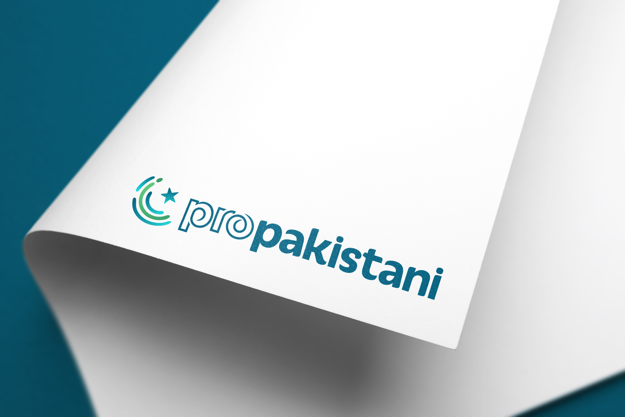
ProPakistani is an evocative name and brand. The new logo captures this sentiment, our roots, our ethos of creating local content that matters, the affinity you feel with this brand and our collective passion for Pakistan.
The icon is an amalgamation of the crescent and star from our national flag and a fingerprint. Our mission has always been to create a brand for the people, for each of you. The crescent and star represent our localized content, our shared love for our country and the fingerprint is the sense of identity and the individuality each of us bring in our mission to create a better Pakistan.
We want you to know that ProPakistani represents the content you want to see, say the things you want heard and stand for values you adhere to and possess. Replace this fingerprint in our logo with yours and it’s the same thing. What unites us is our country and ProPakistani, as a brand, is me, you, it’s all of us.
This revamp is a labor of love. Credits go to Ali Ashraf, a friend of ours who made this design from start to finish with great passion. The logo was created by the talented Shehryar Khan. It was developed by our in-house dev team headed by Maavuz Saif and Arbab Hassan, who stayed up many a night to make sure it’s faster, more responsive and sleeker than ever before.
Over the next few weeks, we’ll be rolling out updates that will further improve user experience. Experiments and A/B tests will help us optimize the design in general. In addition, we’ve planned some exciting additions over the next few months which will make ProPakistani even more useful than before.
Stay tuned for the updates, and feel free to let us know your thoughts (and any bug reports) in the comments below!
– Aamir Attaa, founder and Syed Talal, Editor-in-Chief