As you’ve probably noticed, ProPakistani has gone through a complete design overhaul. Starting today, we have rolled out a cleaner, bolder and far more modern design that was built on a content-first principle.
Our goals were simple: create a distinct identity, emphasize on sections, improve engagement, and simplify the navigation. And after months of brainstorming and prototyping, we are finally unveiling the new ProPakistani to the public.
Data Defines Design
The initial phase of any successful design process includes understanding the user. Apart from interviews and surveys, this is best done using careful analysis of site behavior data.
We started off by asking a few questions that could quantify the user behavior to some reasonable extent. Some of these questions were:
- Traffic % from site (google) search queries?
- Average # of words in a search query?
- How many % of people click on sidebar recommendations?
- How many % of people click on main home page link in header?
- What were the traffic changes during last few redesigns?
Prototyping Activities
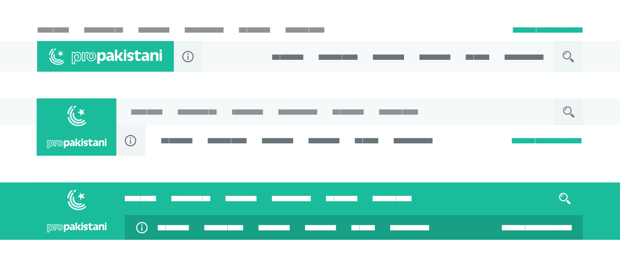
When the redesign was kicked off, we had a wide range of ideas and opinions about how the end result could look like. But one thing was certain, the design had to be simpler! The site was dissected into general elements and each interaction went through series of variations keeping the user in mind.
Typography
For ProPakistani, we chose a modern slab-serif typeface with organic hints. Andada is a proven typeface that has received an award at the prestigious Ibero-America Design Biennial.
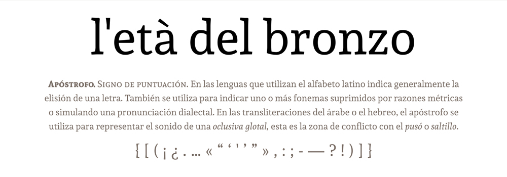
For the titles, we wanted bold typography, and Lato makes a nice choice for improving the content impact. Andada paired with the classic Lato, makes a powerful combination that our users will absolutely love while browsing the site.
Rethinking the Colors
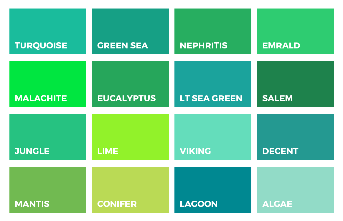
For over ten years, we’ve been using a traditional green color which is quite similar to the one used in our national flag. Now, we’ve shifted to a more modern variant of green that has added shades of blue.
Expanding Focus: Tech, Telecom and Much Much More
ProPakistani has traditionally been known for tech and telecom. As frequently noticed (and pointed out) over the past year, we’ve expanded our focus to other niches. We’ve tested coverage in Auto, Sports, Aviation, Education, Career, Lifestyle and many more areas. Not only that, we’ve significantly ramped up our daily content from 5-10 posts per day to over 30.

These dual changes have irked some of our long term users and we understand. That’s why we placed extra emphasis on ensuring everyone can get to the content they like without scrolling endlessly. Our new filters will help you quickly get to the niches you’re interested in while hiding the rest. If you want detailed coverage in a niche not listed in the filters, we’ve added them to the Others dropdown in our header bar as well.
With the new landing pages for categories and an easy way to filter out the content you don’t want to see, we’ll be able to bring in-depth and comprehensive coverage to everyone regardless of their preferences.
Logo Update: Redefining the Identity
ProPakistani is an evocative name and brand. The new logo captures this sentiment, our roots, our ethos of creating local content that matters, the affinity you feel with this brand and our collective passion for Pakistan.
The icon is an amalgamation of the crescent and star from our national flag and a fingerprint. Our mission has always been to create a brand for the people, for each of you. The crescent and star represent our localized content, our shared love for our country and the fingerprint is the sense of identity and the individuality each of us bring in our mission to create a better Pakistan.
We want you to know that ProPakistani represents the content you want to see, say the things you want heard and stand for values you adhere to and possess. Replace this fingerprint in our logo with yours and it’s the same thing. What unites us is our country and ProPakistani, as a brand, is me, you, it’s all of us.
![]()
About the Team
This revamp is a labor of love. Credits go to Ali Ashraf, a friend of ours who made this design from start to finish with great passion. The logo was created by the talented Shehryar Khan. It was developed by our in-house dev team headed by Maavuz Saif and Arbab Hassan, who stayed up many a night to make sure it’s faster, more responsive and sleeker than ever before.
What’s Next?
Over the next few weeks, we’ll be rolling out updates that will further improve user experience. Experiments and A/B tests will help us optimize the design in general. In addition, we’ve planned some exciting additions over the next few months which will make ProPakistani even more useful than before.
Stay tuned for the updates, and feel free to let us know your thoughts (and any bug reports) in the comments below!
– Aamir Attaa, founder and Syed Talal, Editor-in-Chief
Stay Connected with ProPakistani
Get the latest news, tech updates, telecom insights, and business stories wherever you prefer.
Add ProPakistani to Preferred Sources and see more of our stories in Google Search and Top Stories.


Congratulations to the entire team on launch of new website, Propakistani has played an important in shaping eCommerce Industry. The design looks amazing, can’t wait to see the above listed features.
Good work and Congratulations team ProPakistani. Really nice to see this design. Good luck! :)
Great Start from 2018 :) Thumbs UP to You!! Wish you Good Luck.
Congratulations – Pakistan Zindabad :)
Abdul Wahab ?
he is jealous ;)
He is blocked in Pro pakistani. because he has no identity. so cant be “PRO PAKISTANI”
Well done Team ProPakistani, I like the logo more ?
looks cool. but should pro be the white and pakistani be green?
previous design is much better. this design is annoying
Props for the new design, Ali and ProPK team. I really like this one. Keep setting the bar high!
Amazing! Just wanna know how much did you spend to make it possible! It even looks great than Techradar and other leading websites of the world! @aamir7:disqus Mubarakaan to you and all your team!
Zabardast. Nice color selection.
Nice overhaul. Thumbs up.
Looking forward to more updates.
Nice choice of logo and Thumbs up for new color scheme and design.
Congratulations
Where’s ProPakistani ki “Jaan”, Mr. Abdul Wahab?
Hush please.
Everything is ‘tidy’ for now and let it be …
Congrats, Read more link was not working on tech-and-telecom featured post.
I Think Comments Ka Font Size Chota Hai Bht!
good design and logo
Great Work & Congratulations for new design …
Congratulations to Aamir Attaa and ProPakistani team!
I hope you guys will seize from sharing click bait news and upgrade yourselves.
Finally a good design from a Local website, thumbs up team Propakistani.
Nice design :D typography is great and overall experience feels so clean and to the point, congratulations :D
cool ?
i appreciate your new design for ProPakistani well done Propakistani Team
Finally, a proper LOGO . . . took 9 years to get here. ?
Nice design; Simple, Elegant and clean! Congratulations on getting the blog overhauled. However, the font used in the logo could have been more better. Existing one doesn’t exactly give pro look in my opinion. Rest all great, great work guys and May Allah bless you with success in future as well!
Pakistan First, Pakistan Zindabad!
There is a lot unused space around articles. can be used for various purposes. Just my opinion.
Otherwise a Fresh Design , Looks very pleasant to eyes. You should also include dark mode. Congrats ProPK. https://uploads.disquscdn.com/images/640664569ed8aacd8695791c3c0ec30977dc7933cf1d97b3a432c21ffb2ee230.png
Its a good change. New year comes with new redesign. I love it. Keep up the good work.
Logo Idea is great :)
Very well done, a fresh new look of a trustworthy platform. Always keep Pakistan first. Wish you all the best.
Congrats for new design, but can be more creative …
is that useless space reserved for ads.
https://uploads.disquscdn.com/images/cf621ab48e1ec1a72ba7e0d078f8288a6567401ebb0153a1af02eb0def168085.png
I was thinking the same. But 90% of the international magazines and blogs also have useless spaces on left and right.
Awesome Design ? great work guys, keep it up ? you are running one of the most desired site of Pakistan ??
Congratulations. Design looks amazing and fresh.
Okay, gotta hand it to you guys, this actually looks pretty effin awesome. A fresh start for a fresh new year. Was a nice surprise.
Now let’s see if the quality of the content goes up as well. You guys have made and broken many promises in the past. Finally you have a good thing going, so better not ruin it this time please.
This one looks great.
Great work Team ProPakistani!
Design Acha Hai Lekin Khicchri Pakk Gaye Hai… Isliye Pahle Wala Theme Ziada Behtar Tha…
Wow, just awesome design MashaAllah. Hard work is being reflected from your work.
Very cluttered, over doing a bit….and how to get to older posts like in previous version???
very nice eye soothing look
Excellent logo loving it
pleasant upgrade and well written article, now its time to upgrade Wahab.
Awesome! Congratulations ProPakistani ?
nice design but previous one was more simpler and i was used to it
Logo kq maza na aya should b more clear. Smaller logo doesn’t seems as good as bigger ome
Great work ProPakistani team, since this couldn’t be an easy job as it clearly shows efforts and innovation behind it. Happy to see my web has reborn as ProPakistani is my default page ;)
It’s pretty much alike techcrunch, please correct me if am wrong…
Great Job
best of luck, well done
The new design is awesome :)
Add a calender type feature to jump to past articles quickly and please please introduce “read in urdu” too.
The search bar covers the logo. Doesn’t feel nice.
The new design looks very cool. Great work!
Sorry to say but this design scores less than 3 in terms of usability. It might have better colours and/or fonts but readability is poor. I don’t see it fascinating rather confusing especially the homepage.
The sticky top menu bar is very irritating on desktop, covering the top half of the page on my 14` laptop screen. It was fine till you added goto(.)com(.)pk link which has doubled its width.
New design looks good but i can’t understand Why goto logo is on navigation bar is this sister co.?
Nice design. dear but please check main header there is two goto logs. check screenshot https://uploads.disquscdn.com/images/f33e1fb99887d4f3fa0012531285a6993c7b134dcc899dfe649d3ef06daed254.jpg
Pls press ctrl+F5
Wonderful UX. ProPakistani team best of luck :).
Please make the site available on Google Play News Stand.
Thanks
Very lovely logo design.
Goodluck.