Google’s mobile search is soon getting a visual redesign focused on simplifying how the search results look. in a recent blog, the company announced,
We wanted to take a step back to simplify a bit so people could find what they’re looking for faster and more easily.
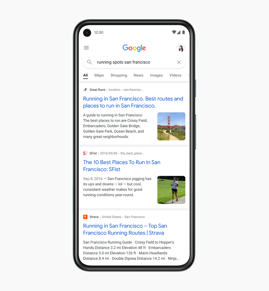
The blog details that the redesigned Google search will have larger and bolder texts that will be easier to scan. Result pages will now run edge-to-edge with larger text, fewer shadows, and more purposeful use of color to illustrate what’s important. This means that the results will take more width of the screen and colors will be used to highlight the important text.
Here’s a picture of how the search results will look after the update is rolled out.
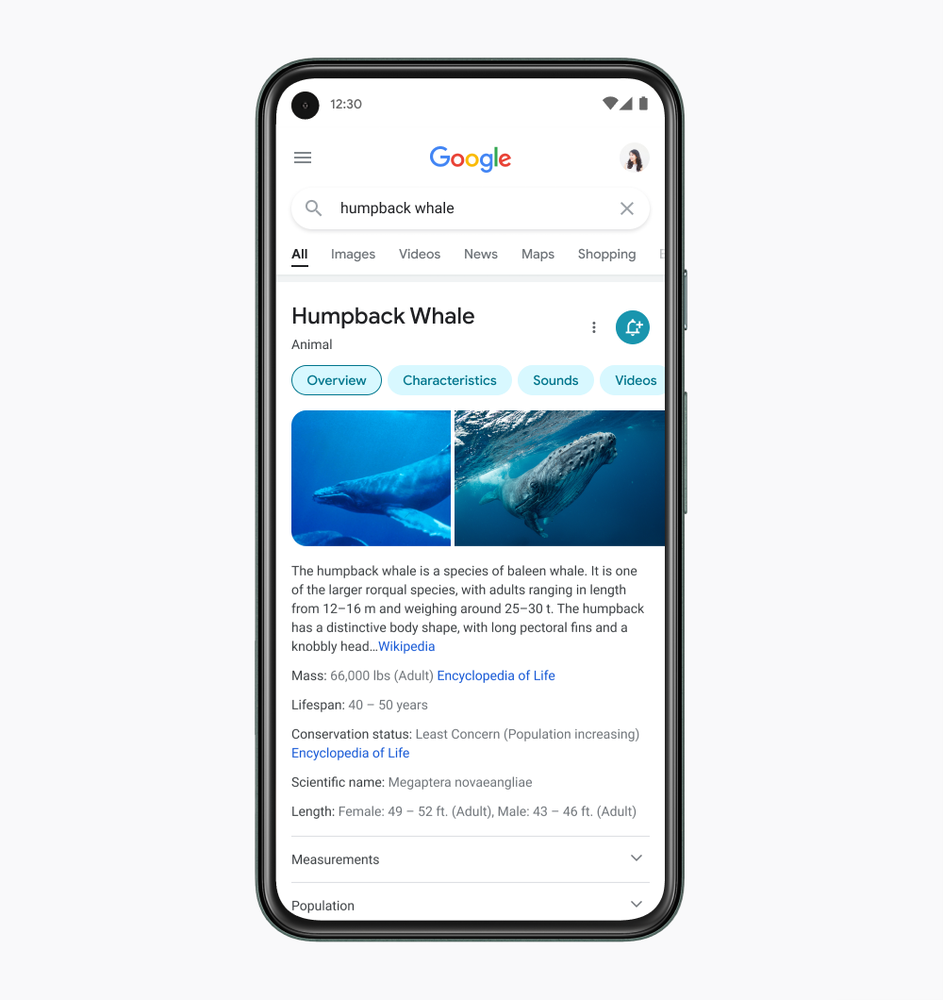
The new design puts more information higher up the page and reduces some visual clutter, which will hopefully make results easier to parse. The company has gone for more rounded imagery and increased use of the company’s signature font.
This is not a huge and drastic change but it is definitely a welcome one. Google has acknowledged that phone searches are all about speed and fanciful graphics do not matter. This is especially important when you are in a hurry and want to tap the most relevant post.
According to Google, the new update will be rolled out in the upcoming weeks.
Stay Connected with ProPakistani
Get the latest tech news, telecom insights, and product launches wherever you prefer.
Add ProPakistani to Preferred Sources and see more of our stories in Google Search and Top Stories.