Zong is relaunching its brand, which will see it completely overhaul its logo, brand positioning, brand presence and all marketing efforts that they will carry in future.
ProPakistani has gotten hold of the new logo that Zong is going to adopt very soon.
Sources tell us that the rebranding is led by Zong’s desire to look at the future and position itself as a true innovator and digital leader in the market.
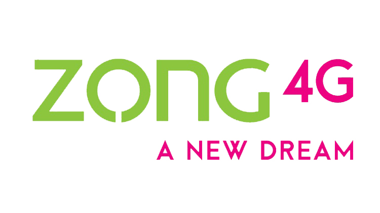
The new logo — as shown below — employs brighter and more optimistic colors and the tagline looks towards the future: A New Dream.
This is Zong’s first major brand overhaul since it started its operations in Pakistan. We don’t forsee much changing for customers in terms of services offered but Zong as a company is embarking on a new chapter in its journey in Pakistan.
Our sources indicated that there’s a lineup of packages and offerings in the pipeline, but they’ll take a month or two to surface.
Check below the new TVC that Zong will air very soon:


mera 4000 b es main laga lia :(
Haha :D
Interesting
Everyone is rebranding except Warid :p :3
Because it has been merged with Jazz/mobilink
aamir bhai video show nahi ho rahi kain phir se youtube ban to nahi hogayi
bilcul sahi chal rahi ha meray pas to
isko yeh log logo kehte hain? Strange, mujhe tu yeh kisi hair removing cream ya toothpaste ke colors lag rahe hain. I mean seriously strange choice of colors…
Baki Teaser Ad Impressive hai, magar us main bhi beat kahin aur hai aur drummers ki movements kahin aur, I think properly sync nahi hua pora.
Bhai They probabaly choose green from Pakistan’s flag I suppose but you are somewhat right about color combination.
Zafar bhai, even if they choose color from Pakistan’s flag, even then this green is not even close to the green in our Great National Flag. Our Flag’s green is somewhat closer to ProPK header, what do you think?
These colors are picked from China Mobile logo the parent company of ZonG.
I am agree with you about this
rightly pointed out… looks like an ad for VEET
Salman bhai aap apnay posheeda baal saaf karwa laina ZONG 4G say ……………ha ha ha
Lekin jo marzi kar loo KATRINA phir bhi nahin lago gay………..ha ha ha
You are right. Logo is not good. some third class and cheap looking logo
کیا آپ کا مطلب ھے گدھا وھی ھے صرف اسکا کھتہ بدل دیا۔
Lols
according to nation’s “mindset” :D
Rebranding and refreshing a logo is a good thing but seriously I don’t like it ! Very strange and ordinary type color selection. I must say despite the worst voice and 3G service, telenor’s logo and color scheme is the most beautiful of all. Zong is the best in all services and packages so I’ll remain stick to it .. Best of luck for ZONG
Panama Leaks, GOT S06E05 leaked aur ab Zong ka AD Leak
I am not expecting much, as they are worst customer servicing network
zong postpaid information is missing on the main website of Zong. Is it only rebranding or something new?
kya mobile connection baichny k lye gana bajana zrori hai??
Kia aapka ilaaj k liye Canada jana zarori hai?
aap k chachu sharif jo surgery kra rhy hai os bhi koi comment karain na….
Qadri Sahab, sawal Aata aur jawab Chana? Baat kuch jachi nahi Qadri Sahab.. Sawal ka jawab dain goli na dain.
I totally agree with Tahir Padri’s objection. Corporations should not dance to sell their mobile phones or milk (it is not necessary to shake milks to sell milk). Otherwise, give the task to “hijras” to dance “gali gali” and promote their products. Corporations won’t have to spend hefty some on tv ads then as hijras will do it for pennies.
Haha.
Mujhe bhi sab se pehle yahi yaad aaya.
Look at the Logo. LOL :D
Zong started copying Tarang in TVC :D
Good luck anyway!
They must be inspired by shaking milks to sell milk.
you are right thats why they were also shaking milks in the AD………..i hope you understand ;)
What the what
hahahaha
Sahi kaha Khurram bhai yehi logic hogi in colors ki, but aapko kaise lage yeh colors?
Dost I am in ZonG that is why :)
Bht sharp colors hain.
very girly soch of u
Good, Zong 3G is getting poor day by day i was getting 6 Mbps speed continously before 5 months but now poor speed and no one claim responsibility
Rebranding pe koi achi si offer deni chahye thi
Dear adnan nay chikni bachiaaan nahin deekhein AD mein ………..that is the first offer for your eyes treatment. if you can see them it means your eyesight is 6/6. whatelse you need.
Har bachi par nazar
Aur ye logo k sath 4g lagana zaruri hai?
They should just change their Name for once… instead of ZONG ding dong…. revert back to CMPAK…. its a wonder no one suggests that to their marketing teams…!
susta sa logo design hai had hai paisy bachany ki bhi
IDDHA tooooon Sadqain…………aap ki itni kaabliut hoti to aap ZONG ke designer hotay
zarori nh k mein hi design krun market is full of talent ppls
Oh man mein to ap ko talented samajhta tha ?
susta logo kanjoosi ki had hai
I think they use $5 Designer on Fiverr :) to design their logo.
Hahahaha, Comment of the day :-D
Really the color scheme and fonts they use are free so thats why this logo looks awful.
Logo design of a brand must be unique and show brand work :)
logo change krne se poori company change ho jaye gi kya?, logo ka achaar daalna hai hum ne?
ohhh man, Even my Little brother can use Word better!! These is likes new IG logo!! lol
Website has nothing related to postpaid now, what’s happening?
Let’s see what the new logo gonna do….anticipating good service hope you don’t let us down.
It is becoming a trend in telcos to rebrand whenever u get a new mkt head. Its all personal nothing business on cost of business
I don’t know WTH is their branding n marketing team thinking, 1st of all its not the right timing, would come across as copying Mobilink’s Jazz rebranding – Remember Jazz was Aamir Ibrahim’s success story so when he came back, he felt mobilink lacks coherent branding strategy or it could simple do better.
With Zong, their current logo is very good, if you look at the color scheme and that round ring shaped circle.
The new one is terrible to be honest, it doesnt feel like a telco operator and also lacks a logo, putting ZONG 4G isnt a well thought out logo. I think someone’s been going to fiver.com to get this logo done as cheap as possible :)
Kisi ke samajh me ZONG ka ye new AD aya ha?
ZONG ke marketing team buhat he bakwas he.
If this is called a logo relaunching, I guess they have re-launched a logo for lawn brand
Are they serious? This is Zong’s branding. They have gone nuts with their sense branding. They have confused people weather its a telco’s Ad or A Film Industry’s Movie Trailer :/
rebranding, logon mujhey to android ka logo lag raha hey just smartly copy kia hey :)