If you ever felt that the app of your preferred social network felt like a relic from the past, now’s the time to rejoice.
Twitter is finally implementing the long overdue update for Material Design on its Android app, allowing it to blend more freely into the overall ecosystem.
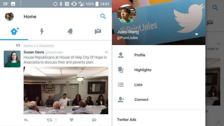
The app is further implementing changes in its user interface. There are now four tabs on the top: Home, Moments, Notifications and Messages. Moments, Twitter’s go-to feature for keeping up to date with the trending news may not have been successful so far but now that it is an integral part of the app, that could change soon. The tabs can either be selected from top or swiped horizontally.
A swipe from the left side offers you links to your profile, Highlights, Connect, lists and more. You can also switch between your three accounts from there.
A new floating action button allows you to compose Tweets from anywhere, and of any kind. The fix to the older, boring design is already being rolled out via an app update to Android users. Make sure you are there when the upgrade hits.
The upgrade in design isn’t a surprise has Google has been pushing developers recently to abide by its new, stringent design philosophy. If anything, you should expect most remaining major apps to roll over to the whiter and cleaner design soon.
Stay Connected with ProPakistani
Get the latest news, tech updates, telecom insights, and business stories wherever you prefer.
Add ProPakistani to Preferred Sources and see more of our stories in Google Search and Top Stories.