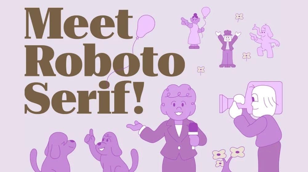
Google has introduced a new version of its Roboto font and is bringing Serif back with the Roboto Serif.
The latest font has been designed in collaboration with Greg Gazdowicz from Commercial Type to create an upgraded version of the Roboto Sans typeface.
The new font feature newly drawn letters that “thinks about Roboto, but is a new and original design” as highlighted by Google UX manager Rob Giampietro. The new font still makes use of the same vertical proportions of the Roboto Sans – mixing the serif and the sans-serif into a single design.
Serif fonts are known for their simplicity and are easier to read with distinct letter shapes. The latest typeface from Google expands on the virtue of being a variable font that can be optimized for different-sized displays.

Vox notes that chunkier, retro-styled serif typefaces will soon be coming back in style with a bang after years of minimalist sans-serif domination.
Google has been using the Roboto font for over a decade now. The font was first introduced with Android 4.0 (Ice Cream Sandwich) as the default font. Since then Roboto has seen several variants.
Google’s primary font Product Sans, however, has steadily taken over Roboto across different products.
Currently, the company only plans on adding Roboto Serif to Google Fonts as simply another variant of the Roboto open-source font family.
Stay Connected with ProPakistani
Get the latest tech news, telecom insights, and product launches wherever you prefer.
Add ProPakistani to Preferred Sources and see more of our stories in Google Search and Top Stories.