
by Adam Dawood
When Yayvo launched in September 2015, we inherited our website from our past moniker, TCS Connect. That site, though functional, was not considered visually appealing or user-friendly.
Since December we have started to place a lot of emphasis on our UI (User Interface). Being an e-commerce company we wanted to be fully data driven and over the course of the last three months, we have made some impressive strides. This article aims to share some of our learning experiences in the hope that you may also be able to start your journey to providing a bigger and better user experience for your customers.

Typical journey for an eCommerce customer
Yayvo’s integral aim has always been to provide their patrons with as seamless a customer experience as possible, helping them through each stage of their journey while showcasing Yayvo’s strengths in terms of delivery and customer experience.
Before we discuss the aspect of data, it is important to give credit to the Product, Design and Technology teams at Yayvo, who have put in many hours into what will be just the start of our User Experience (UX) journey.
Data Driven Design
Our team began with having to make an extremely important decision – which A/B or Multivariate testing tool to employ. We considered two options: Optimizely or Visual Website Optimiser (VWO). Due to its user-friendliness and simple technical implementation, VWO came out on top. (Tip: Don’t directly trust the data provided by VWO, verify the results by checking them within Google Analytics as well.)
Test 1: Product Page Call To Action
Our first major task was to see what portion of our product page attracted of the highest Call to Action (CTA).
End Goal: A better CTA
- Describes Next Action vs. End Result (e.g. – ‘Add to Cart’ vs. ‘Buy now’)
- Must contain a trigger word (e.g. – “Buy” or “Add”)
- Gentle Nudge vs. Commitment Requirement (e.g. – ‘Add to Cart’ vs. ‘Buy now’)
Hypothesis: Instead of using the simple word ‘Buy’ as the CTA in product pages, use variations which contain the aspects mentioned above.
- Control – Buy
- Variation 1 – Buy Now
- Variation 2 – Add to Cart
- Variation 3 – Order Now


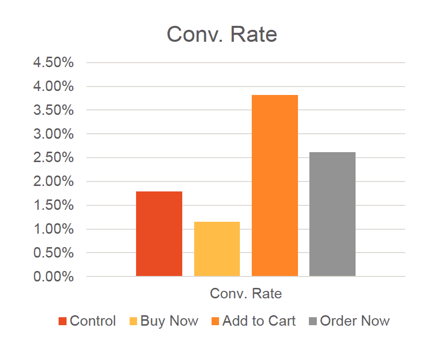

After running the test with 2800+ users, we determined quite conclusively that “Add to Cart” was the best conversion-driven CTA. Its conversion rate was 2% greater than the incumbent CTA, with a 100% degree of certainty.
The winning variation, ‘Add to cart’, has the following characteristics:
- It indicates the exact event that happens after the click.
- It does not rush the user (less commitment than having ‘Buy’ or ‘Buy Now’).
Test 2: Color of the Call to Action
We then decided to run a test on the CTA color of our product page. We wanted to test variations based on our research about the strongest colors for CTA’s. The existing red was our control and we added green as the variant. Green was selected because we felt it was the tone that contrasted most against red. This was important as our website has red as its primary color.

The results showed that the green button led to a higher conversion rate over the red button.
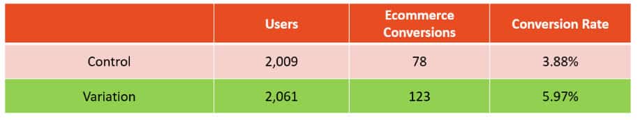
The fact that Green was the highest converter contradicted three studies we came across that seemed to show that red was a much better converter: DMix, HubSpot, VWO.
If Red was such a good converter, then having a website with numerous red elements could potentially be a distraction to users which may result in a lower overall conversion rate. Our team also felt that the overtly red overtone of the website was overpowering. This led to our decision to reduce where possible the red elements of the website.
Reducing the Red Impact
Yayvo from the start has always had a red theme associated with it. However, from a personal perspective and comments from users we knew it had to be re-evaluated.
At this point, we decided to take a visceral approach to design rather than conduct tests. Our goal was simple – keep a customer’s focus only the essential task at hand on every page by limiting distractions.
We made the following changes on the homepage:
- Replaced the red color in the category header bar with Grey, while making the category drop down red.
- Removed the partner websites from the header and placed them below the fold in the footer.
- Changed the red color of the category selector (just below the sliders) to orange.

After the changes the tone of the overall website changed quite dramatically.

Product Page Overhaul
The product page also underwent a fairly large change. We conducted focus groups and internal surveys that led to the realisation our product page needed to become more convincing in pushing users to purchase. Further still we conducted heat map tests on our product page to identify the most used features and those that were surplus to requirements.
Design Principles: Focused Push Towards Conversion
- Show the customer as large an image as technically possible.
- Show a clear CTA.
- Make it straightforward and intuitive to choose options.
- Easy and precise identification of mistakes.


Checkout Overhaul
The checkout page is the final hurdle a customer has to face before they commit. Given the sheer amount of information required at this phase, customers can easily bounce off the page and not complete their transaction.
Design Principles: A Simple & Intuitive Process
- Keep information requirements to a minimum.
- Guide the user through the next steps
- Limit distractions
- Easily identifiable any mistakes in input

Design Changes:
- Removed all elements of the Header and Footer except the logo and the Contact Number Bar
- The logo is no longer clickable to the homepage thereby reducing to three the ways in which you can move away from the page:
- The back button;
- Edit Product Option in Section 4 and;
- Close the Tab/Browser.
- Clear CTA – “I Confirm My Order” – which due to its size and color is the most prominent element of the page.
- Reduced number of fields required in the shipping and billing option.
- Hide the booking code requirement – which is only used by a tiny subset of users.

Performance & Results
With each major change we also monitor our overall conversion rate after implementation. While it is difficult to attribute any increase or decrease in conversion rate directly to any one change, factors such as marketing campaigns, exclusive stock availability, new product launches all can affect the overall conversion rate in a significant way, however we try and control for these by filtering down to the most common attributes when we measure the results.
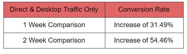
To check the success of the overall checkout page we created filters so that only direct traffic and desktops views would be counted. When we did this we noticed that our conversion rate had increased by a significant 31-54% over 2 weeks.
Next Steps
The changes and tests we have run is just a first step for us. While we have decided to start with the overall UI of the website, what is far more important is the user experience we can create. More than color testing the buttons on the online portal, we feel that creating a sustainable business is about providing a good delivery experience.


Has anyone noticed that Mr. Abdul Wahab is missing since few days ??
I noticed. @Aamir I hope you didn’t blocked him?
Mr. Abdul Wahab, we need your precious review for this article.
He’s blocked by admin
So afterall the changes, you got more products added to the cart and the UX still sucks on Yayvo and there’s a complete lack of strategy on how to drive the channel. No wonder tech cannot solve anyone’s problems.
Well said.
They still need to improve their PDP and checkout page.
Using too may section/images is not considered ‘good’ website.