Google seems to be on fire this year with its app updates. First, we saw the search engine giant update the Gmail layout and now, after 8 whole years the platform has finally rolled out probably its most-awaited update, refreshing Chrome’s logo.
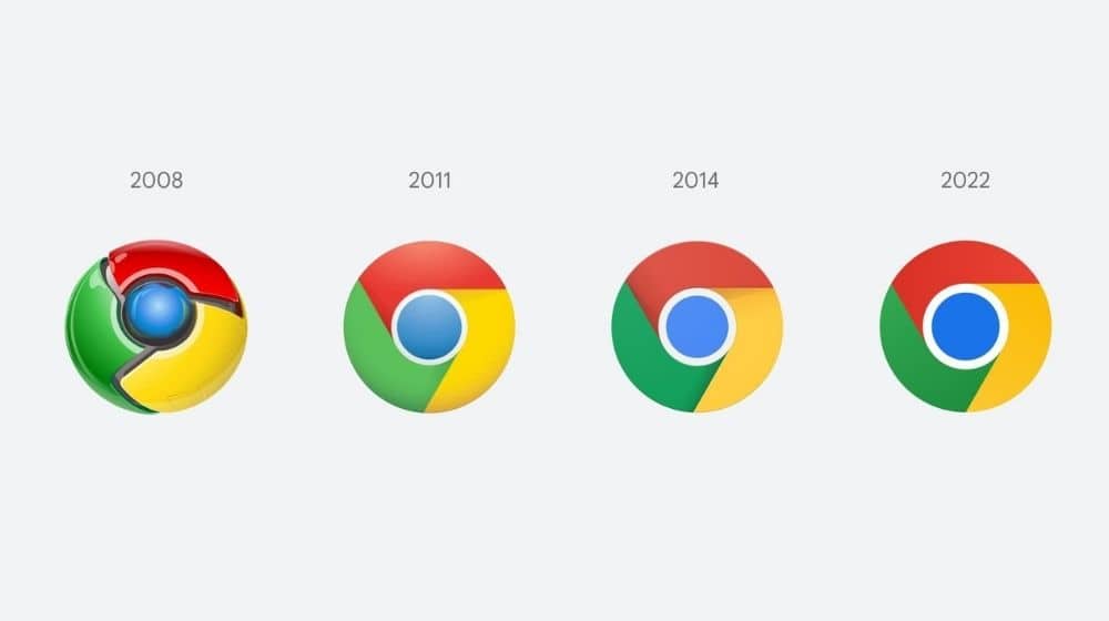
Chrome’s logo is getting an update for the first time since 2014. However, the difference is quite hard to spot since the change is quite subtle but if you look closely, you might actually be able to distinguish the new version from the old one.
Elvin Hu, a designer for Google, gave us a good first glance at the logo’s new design via a Twitter post. He further shared the underlying design concepts in the thread.
Some of you might have noticed a new icon in Chrome’s Canary update today. Yes! we’re refreshing Chrome’s brand icons for the first time in 8 years. The new icons will start to appear across your devices soon. pic.twitter.com/aaaRRzFLI1
— Elvin 🌈 (@elvin_not_11) February 4, 2022
The new logo has brighter colors and a larger blue circle in the center without any shadows. The colors, this time around, look more vibrant on the account of eliminating the previously present shadows.
Chrome’s modest change won’t be confusing as it’s so subtle. The company started making the change in Chrome Canary, the developer version of Chrome, but it’ll spread to the beta and mainstream versions in the upcoming weeks. The company is tweaking the main Chrome logo further to look more at home on Windows, MacOS, and iOS
On ChromeOS, the logo’s colors look more vibrant to complement the other system icons, while on macOS, the logo gives more of a 3D look. Meanwhile, the colors in Windows 10 and 11 versions, are graduated and seem to be getting darker toward the bottom.
However, with Chrome’s supremacy, owing to 63% of the web usage according to analytics firm StatCounter, there’s a strong discouragement for Google to make big changes.


