At its two-day launch event that started on 29th March, the Chinese smartphone manufacturer launched several different products including the Mi 11 Pro, Mi 11 Ultra, Mi 11 Lite, Mi 11i, the new Mi band, a smart projector with Google assistant, and the much-awaited Mi Mix folding phone.
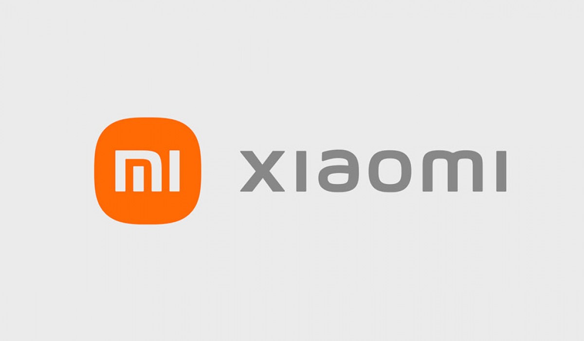
In addition to these products, the company also announced that it was revamping the company’s logo and identity. The company hired the famous Japanese graphic designer Kenya Hara for its new logo which follows a minimalistic approach. According to Xiaomi, the logo brings a brand new “Alive” branding identity to the company.
Here is what the new logo and branding look like.
The main changes in the logo are rounded edges. The designer has also added new MI typography which adds a more aesthetically pleasing look to the company’s name next to the logo. The company said that it wanted a logo that was more agile and would help its brand identity stand out. It wanted the agility in the logo to symbolize its agile nature heading into the next decade.
The new logo does look more sophisticated. Although it retains the colors from the previous logo, the shape, and the new font has added a lot to the sophistication.


/cdn.vox-cdn.com/uploads/chorus_image/image/69047711/Screen_Shot_2021_03_30_at_12.51.31_PM.0.png)


